iOS 7's Design is Confused
Today, Apple unveiled the newest version of iOS 7. While the fact that the design was changed radically is not surprising, the actual changes themselves are…confusing.
With Windows (Phone), Xbox, Google, and various other companies taking a "flatter" approach to UI design, it only makes sense that Apple would want to follow the trend of simplicity-- especially now that Scott Forstall, the guy known for the skeuomorphic design elements present in previous versions of iOS. After all, that is what Apple strives for (especially in their hardware).
iOS 7 directly reflects the transition from Forstall to Ive's rule over iOS, but are the changes truly an improvement?
Note, the following statements are my own opinions. Everyone has a different preference for styles, and I am not suggesting any style is inherently better than another.
The home screen of the iPhone is critical-- it houses the icons for all of the user's apps, and without it, the iPhone would be useless.
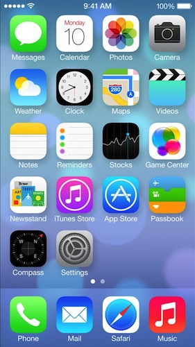
Immediately, you'll notice the "flat" design for each of the icons. However, Apple's decided to keep a sense of depth throughout the entire operating system with the parallax effect and their distinctive "layers".
But, take a look at the various icons-- some of them have gradients (Mail, Safari, Music, Phone, etc), while others do not (Clock, Reminders, Game Center). Those icons with gradients also are largely inconsistent, with the "light source" seemingly to randomly come from above or below the icon (e.g. half the gradients are light-to-dark, while the others are dark-to-light).
And, what's up with the Game Center bubbles? I thought Apple was trying to get rid of the glossy elements.
Then, there's spacing problems. A lot of the UI elements seem cramped and smashed together in a padding-less mess.

Control Center, pictured above, seems to cram every single possible control into a sheet that slides up from the bottom of your screen. Here's a thought-- reduce the clutter and move things onto multiple pages, or remove useless buttons like the calculator and timer buttons. Or, how about making it user customizable?!
Even worse is the messages app--
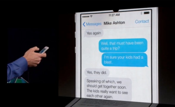
There's a little bit too much public display of affection between the message bubbles. Give them some space and room to breathe.
It's clear where Apple is trying to go, but their design is slightly confused in that there are various inconsistencies in various elements, like gradients. Even more, there's some places where the skeuomorphic design hasn't been completely eradicated (e.g. Game Center).
Despite these design problems, the interface is still usable. A "wrong" gradient won't hurt anybody. But, there are some serious UX issues that need to be fixed as well.
Take a look at the new lock screen:
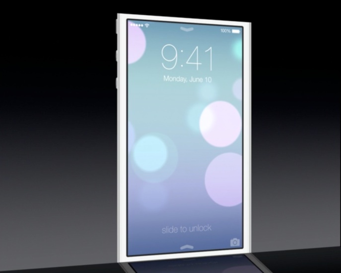
From the lock screen, you can pull the Notification Center down, Control Center up, or unlock the device by… Wait a minute-- which direction do you swipe to unlock the device? The arrow closest to the "Slide to Unlock" text points up, but that's for the Control Center.
Previous version of iOS had an arrow embedded into a "track", which made it extremely clear how to unlock the device. Here, there's really no clear action.
The same comment applies for the "slide to answer a phone call" bar, and presumably any other slider ("slide to power off").
The camera button in iOS 7 on the lock screen also seems to be hiding in the corner (again, with little space between the border of the phone and the icon). At least the screen bounces when you tap the icon, indicating what action you must perform to unlock-to-the-camera.
Apple still has some time to figure out iOS 7 and its direction, but because the change is so radical and risky, they better get it right or suffer from serious backlash.