Text Posts
Though HTTPS has been an option for my site for a little while now, I haven't enforced it outside of various commerce related pages (e.g. the shopping cart). Starting now, not only is HTTPS required to browse my site, I've enabled the HSTS header to ensure that unencrypted connections are never allowed.
What is HSTS?
HSTS stands for "HTTP Strict Transport Security". This does a couple of things for the modern browsers that follow this header--
- Any links on my website that point elsewhere on this same domain will automatically be changed to HTTPS. I have used protocol relative URLs or CMS-generated URLs most everywhere, but this should ensure that anything I've missed will stay encrypted.
- For the defined period of time (I've chosen a year), if you connect to my site and there are any HTTPS related issues such as an expired certificate or invalid certificate, your browser should not even allow you to bypass the warning message.
Why HSTS?
Of course, given that you will be denied access to my website if I accidentally misconfigure something related to SSL or even if my CA's certificate has problems, why would I take the risk of downtime and lost traffic in the same of encryption?
My website is primarily a blog-- it does allow you to purchase various tutorials I've written and apps I have developed, but the vast majority of my visitors land on a content page with no sensitive information. Despite this, I believe that each user is entitled to both privacy, as well as security from ISPs and establishments that perform bad practices such as ad injection. With enforced HTTPS, your hotel or coffee shop will no longer be able to see what content you are specifically looking at1, and will not be able to inject their own ads or tracking software into my website.
- Of course, without encrypted DNS, an attacker or privileged user will still know you are accessing my domain ↩
PHP is an interesting language, and to many it is considered a language that is archaic and badly designed. In fact, I largely agree that PHP's design is not optimal, but there is no other language in the world that is both easy to learn and deployable on almost any shared hosting service so easily. This is changing, but for now, PHP is here to stay.
By design, PHP does not have explicit typing-- a variable can be any type, and can change to any type at any time. This is in stark contrast to other languages, such as Apple's Swift, Java, and many others. Depending on your background, you may consider PHP's lack of explicit typing to be dangerous.
Not only this, but PHP is not the most performant language by any means. You can see this for yourself in TechEmpower's famous framework benchmarks. These results clearly show that PHP is at or near the bottom of the pile, being beat outright by languages such as Java and Go.
So, how do you make one of the most popular languages in the world for web applications usable again? Many say that PHP simply needs to be killed off entirely, but Facebook disagrees.
HHVM is a project designed to revitalize PHP. HHVM often beats PHP in performance benchmarks, and supports a new explicitly typed language-- Hack. Hack, sometimes referred to as "Hacklang" so that it you can actually search for it on Google, is almost completely compatible with standard PHP. With the exception of a few quarks, any PHP file can also be a valid Hack file. From there, you can take advantage of new features such as explicit typing, collections, and generics. For example:
<?hh
class MyClass {

public function add(int $one, int $two): int {

return $one + $two;

}

}
As you can see, Hack is very similar to PHP. In fact, Hack is really just an extension of PHP since you can simply begin any PHP code with the <? hh tag to make it a valid Hack file.
So, how do you get started with HHVM and Hack? Unfortunately, Mac OS X and Windows binaries are not provided officially, and though you can install HHVM yourself by compiling it on Mac, it's certainly not the most convenient. An even better way of trying out Hack is to simply use a Linux server. One of my go-to providers for cheap "testing" servers on demand is DigitalOcean, who provides SSD cloud servers starting at $0.007 an hour. Of course, this tutorial applies to any server provider or even a local VM, so you can follow the steps regardless who your provider is.
Booting Up a Server
First, you'll need an Ubuntu server-- preferably 14.04, though any version from 12.04 up will work fine, as does many other flavors of Linux.
On DigitalOcean, you can get started by registering a new account or using your existing one. If you're a new user to DigitalOcean, you may even be able to find a coupon code for $5-$10 in credit (such as the coupon code ALLSSD10, which should be working as of July 2014).
Once you've registered on DigitalOcean, you can launch a new "Droplet" (DigitalOcean's term for a virtual machine or VPS) with the big green "Create" button on the left side of your dashboard.
Go ahead and enter any hostname you want, and choose a server size. You can also choose any Droplet size you wish, including the baseline 512 MB RAM Droplet. If you're planning on running anything in production on this server or wish to have a little more headroom, you may wish to choose the slightly larger 1 GB RAM Droplet.
Next, you can choose the region closest to yourself (or your visitors if you're using this as a production server). DigitalOcean has six different data centers at the moment, including New York, San Francisco, Singapore, and Amsterdam. Different data centers have different features such as private networking and IPv61, though these features are slated to roll out to all data centers at some point in time.
Finally, choose the Ubuntu 14.04 image and create your Droplet. It'll only take around 60 seconds to do so, and once the Droplet is running SSH into the server using the credentials sent to you or your SSH key if you've set up SSH authentication.
Installing HHVM
HHVM is relatively easy to install on Ubuntu, but varies based on your Ubuntu version. The main difference between the commands below is simply the version name when adding the repository to your sources.
Ubuntu 14.04
wget -O - http://dl.hhvm.com/conf/hhvm.gpg.key | sudo apt-key add -
echo deb http://dl.hhvm.com/ubuntu trusty main | sudo tee /etc/apt/sources.list.d/hhvm.list
sudo apt-get update
sudo apt-get install hhvm
Ubuntu 13.10
wget -O - http://dl.hhvm.com/conf/hhvm.gpg.key | sudo apt-key add -
echo deb http://dl.hhvm.com/ubuntu saucy main | sudo tee /etc/apt/sources.list.d/hhvm.list
sudo apt-get update
sudo apt-get install hhvm
Ubuntu 13.04
Ubuntu 13.04 isn't officially supported or recommended to use.
Ubuntu 12.04
sudo add-apt-repository ppa:mapnik/boost
wget -O - http://dl.hhvm.com/conf/hhvm.gpg.key | sudo apt-key add -
echo deb http://dl.hhvm.com/ubuntu precise main | sudo tee /etc/apt/sources.list.d/hhvm.list
sudo apt-get update
sudo apt-get install hhvm
If you've having issues with the add-apt-repository command on Ubuntu 12.04, then you may need to run sudo apt-get install python-software-properties.
Running HHVM
Once you've installed HHVM, you can run it on the command line as hhvm. Once you create a new Hack file with the following contents, try and run it with hhvm [filename.
<?hh
echo "Hello from HHVM " . HHVM_VERSION;
Note the lack of a closing tag-- in Hack, there are no closing tags and HTML is not allowed inline.
Installing and Setting Up Nginx
Of course, installing HHVM for the command line is the easy part. To actually serve traffic to HHVM using Nginx, you have to set HHVM up as a fast-cgi module. To do so, first install Nginx with sudo apt-get install nginx and start it with sudo service nginx start. To verify that Nginx installed correctly, visit your Droplet's IP address and you should see the Nginx default page.
Now, we can remove the default Nginx websites with the following commands:
sudo rm -f /etc/nginx/sites-available/*
sudo rm -f /etc/nginx/sites-enabled/*
Then, create a new configuration file for your website as /etc/nginx/sites-available/hhvm-site. You can change the name of the configuration file if you wish. The contents of the file should be similar to the one of following:
Emulating "mod_rewrite"
The Nginx equivalent of sending all requests to a single index.php file is as follows. Every request to this server will be sent to the index.php file, which is perfect for frameworks such as Laravel.
server {
    # Running port
    listen 80;
    server_name www.example.com;
# Root directory
root /var/www;
index index.php;

location / {
    try_files $uri @handler;
}

location @handler {
    rewrite / /index.php;
}

location ~ \.php$ {
    fastcgi_pass   127.0.0.1:9000;
    fastcgi_index  index.php;
    fastcgi_param  SCRIPT_FILENAME $document_root$fastcgi_script_name;
    include        fastcgi_params;
}

}
Traditional Setup
In this example, any requests to a script ending in .php will be executed by HHVM. For example, if you have hello.php in your web root, navigating to http://www.example.com/hello.php would cause the hello.php file to be executed by HHVM.
server {
    # Running port
    listen 80;
    server_name www.example.com;
# Root directory
root /var/www;
index index.php;

location ~ \.php$ {
    fastcgi_pass   127.0.0.1:9000;
    fastcgi_index  index.php;
    fastcgi_param  SCRIPT_FILENAME $document_root$fastcgi_script_name;
    include        fastcgi_params;
}

}
Also, ensure that you change all instances of the web root (/var/www) in the above configuration files to your own web root location, as well as the server_name. Alternatively, you can leave the web root as /var/www and just put your Hack files in that folder.
Now that you've created the file under sites-available, you can symlink it to the sites-enabled folder to enable it in Nginx.
sudo ln -s /etc/sites-available/hhvm-site /etc/sites-enabled/hhvm-site
Before you restart Nginx to apply the changes, start the HHVM fast-cgi enabled server with hhvm --mode daemon -vServer.Type=fastcgi -vServer.Port=9000. After the HHVM daemon is started, you can then run sudo service nginx restart to apply your Nginx configuration changes. If you have a Hack file in your web root, you should be able to visit your Droplet's IP and see the response.
Starting HHVM on Boot
HHVM currently does not automatically start up when your server is restarted. To change this, you can simply add the line below into the file named /etc/rc.local to run it on boot:
/usr/bin/hhvm --mode daemon -vServer.Type=fastcgi -vServer.Port=9000
HHVM should now start when your server boots up.
You should now have HHVM and Hack up and running on your server-- make sure you take a look at Hack's documentation for more information on the features of the language.
- Singapore is the first region with IPv6 support, while New York 2, Amsterdam 2, and Singapore have private networking. ↩
Over the course of two days in a relatively quiet area of south Seattle, one of the biggest companies in technology took over a quiet building called Sodo Park.
The space, a small, old looking building, is commonly used for events such as weddings, holiday parties, and other corporate gatherings. From the outside, it wasn't apparent anything was occurring at all-- only a few lone parking signs across the street gave any hint of the company's presence. But as you walked to the front door, flanked by a couple employees in nondescript black T-Shirts, it was apparent that this was more than just a "corporate event."
Stepping inside revealed a large, open space filled with mingling event staff and visitors. After I entered through the door, I was herded to a table at which I was greeted by smiling Google employees sitting behind their Chromebook Pixel laptops. After I filled out a media release form and checked in my jacket, I walked into a short queue to be introduced to the functionality of Glass. Behind me were several clear cases containing prototypes of the technology-- smartphones affixed to glasses frames seemed to be a common theme.
At this point, I had a chance to look around the room. Though I had missed it earlier, employees were walking around the room with Glass on. No matter where you were in the room, you were being watched by tiny cameras mounted on each staff member's head.

Several minutes later, a friendly woman came over with a Android tablet to welcome the individuals in the queue to the "Seattle Through Glass" event, and gave a quick demonstration of the gestures. The tablet, which was paired to the glasses, displayed a mirrored version of the Glass interface-- everything she saw, we were able to see as well.
At first, she pulled up sports scores for the Mariners baseball game using the voice interface and showed simple features such as the Timeline. Near the end of the demo, in what seemed to be a shock her audience, the spoke a command-- "Ok Glass, Take a Picture." Immediately, the photo popped up on her Glass display, and in turn was mirrored onto the tablet for us to see. Several individuals were taken aback, surprised by the lack of time to get ready for the photo.
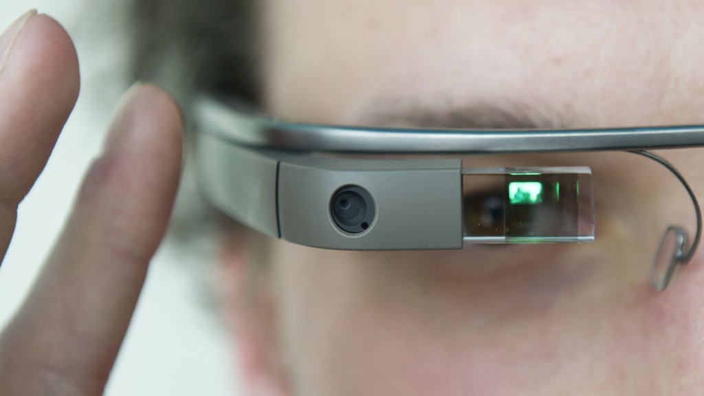
We were then ushered over to a dark corner of the room, and were all provided with white pairs of Google Glass for ourselves to try. After putting the glasses on and adjusting them slightly, I tapped the touch-sensitive panel on the right side of my head and a floating ghost of a display appeared in the corner of my vision.


At first, I was slightly confused-- in all my past experiences, I've never had to think about how to focus on something. After I looked up and to the right, however, the display became clear and in focus.
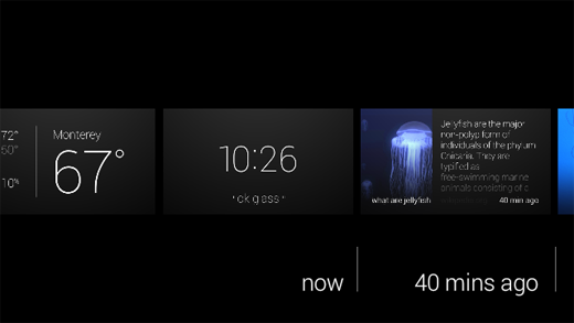
"1:21 PM"
"ok glass"
After the device was woken up with a tap, there were only two pieces of information displayed-- the first being the current time. Just below the thin, white timestamp was simply the words "ok glass" in quotation marks.
"Ok, Glass," I said.
When you pick up a Pebble smart watch, it immediately has a sense of purpose. Similarly, a Nest has a place and function on your wall-- you know what to do with it. Though modern smart devices have capabilities beyond their traditional counterparts, they always have a sense of purpose-- even it that is to simply display the time.
But with Google Glass, I paused. I didn't know what to do. On my face sat a $1,500 set of computerized glasses-- connected to the internet and one of the largest knowledge engines in the world, none the less, and I couldn't summon up a simple query. I had been overcome with a feeling of blankness-- there wasn't an obvious use for Google Glass, in my mind.
I quickly swiped down on the frame, a "back" gesture that powered the display off again.
Once again, I said, "Ok Glass." But this time, I managed to eek out a simple--if forced--question: "Google, what is the height of the Space Needle?"
The device, with its relatively mechanical voice, returned the answer-- 605 feet.
At that point, Glass felt familiar: the voice was the same used in Google Now, as well as Google's other voice-enabled products. The concept of speaking to your glasses was still alien to me, yet the familiarity of Google Glass's response made it seem like another extension of myself in the same way as my phone always had been.
I tried another query-- "Ok Glass, Google, how far is it from Seattle to San Diego?"
This time, instead of the "Knowledge Graph" card displayed in response to my last query, the glasses popped up with a Google Maps card-- showing walking directions from Seattle to San Diego. While it answered my question (it takes some 412 hours across 1,200 miles, in case you're wondering), the exact response wasn't quite what I was looking for.
I tried taking several photos and sharing them on Google+--a process that was relatively streamlined given the lack of a traditional interface--as well as swiping through past "Cards" that previous demo-ers had summoned in the hours before I arrived. The timeline was filled with several different queries and apps, one of which was CNN. Curious, I tapped on the frame as a news story about Malaysia Air Flight 370 was on screen, and the still photo was brought into motion.
This, admittedly, was one of the demonstrations that awestruck me the most. I felt like some sort of cyborg, able to watch breaking news stories on a virtual screen floating in front of my face. The sound was muddied, and though audible, not high quality. While it was passable in the exhibition room, even with the various conversations going on around me, I am not convinced it would have been loud enough to hear over the noise at a bus or train station.
Having played with the CNN story enough, I once again rattled my brain to think of features to try. Eventually, I settled on simply looking up a historical event. I was brought to a minimalistic list of web search results, though I didn't anticipate I would be able to do much with them.
To my surprise, tapping on a result brought up the mobile Wikipedia page in a full web browser. Sliding my fingers around on the frame manipulated the page. Zooming and panning around was relatively natural feeling, though I could not figure out how to click on links.

With the basics of Glass under my belt, I proceeded to the opposite side of the room-- a slightly brighter, more lively corner decorated with guitars and stereo sets. Along with the acoustic equipment was another table-- this time, with several sets of black Google Glass.
A similar routine to that at the first demonstration area ensued, though with one difference-- the Google staff member pulled out a set of odd looking headphones from out of sight, and plugged them into the micro-USB port on the glasses.
With this newest pair of Google Glass once again on my face, I woke it up and asked it to play "Imagine Dragons." Hooked up to Google Play Music All Access, I was able to command the device to play any song I could imagine-- all with my voice.
There are several inherent flaws with listening to music on Glass, however. First, because there is no 3.5mm headphone jack, there is an unfortunate lack of quality headphones. I own a pair of Klipsch x10 earbuds-- certainly not a set of custom in ear monitors that cost half a grand--but leaps and bounds better than the headphones that are included with your phone or iPod.
The earbuds I was given at the event were specifically designed for use with Glass. Not only because of the micro-USB connector, but the length of one earbud was shorter than the other. This was necessary because the distance from the micro-USB port to your right ear is only several inches, whereas the cable leading to your left ear is significantly longer. Normal headphone cords would simply dangle around your right ear.
Like Apple's EarPods, they had a funny shape designed to project sound into your ear. Also like Apple's headphones, to my dismay, the sound quality was relatively mediocre. It was a step up from the bone conduction speaker that's embedded into the glasses frames, but it's not an impressive feat admittedly.
If you listen to major artists, whether it be Imagine Dragons, Kanye West, or Lady Gaga, you'd have no issues with Google Glass. However, some obscure artists would sometimes fail to be recognized by the voice recognition. For example, it took four or five tries for my Glass to recognize "listen to Sir Sly." Instead of playing the desired artist, Glass would misunderstand me and often attempt to look up an artist named "Siri fly."
As I stood there attempting to enunciate the word "sir" to the best of my ability, it was clear that the technology was fair from ready. It's awkward enough to dictate your music choices out loud, but it's even worse if you have to do it repeatedly. Given the number of odd looks I received from those at the event, imagine the reaction of the people around you if you were riding a bus or train.
Eventually, my frustration overcame my initial awe, and I moved to the final corner of the room.
When I walked in I had noticed this particular setup, though without a clue what it was for. There were several boxes, varying in size, with signs on them in some foreign language-- some artistic exhibit, I imagined. But as I made my trek through the swarms of Google employees swiping their temples on their own set of Google Glass, I realized what the subject of the next demonstration was.
The final booth had the most colorful Google Glass frames of all: a bright, traffic cone-orange. Perhaps it was indicative of the exciting demonstration that was to follow.
With the glasses on, the Google employee instructed me to utter a single voice command:
"Ok Glass, translate this."
Instantly, an app launched on the screen with a viewfinder similar to that of a camera. Essentially, it appeared like Glass provided a picture-in-picture experience. I walked over to an inconspicuous, white board.
"il futuro è qui," read the sign.
In an instant, where the Italian once was, Glass replaced it with the words, "The future is here." No kidding.
The concept of in-place translation is not new. In fact, it's existed for several years on other platforms, such as the Word Lens app on iPhone. The impressive part of the demo wasn't the fact that the translation could be done in place, but rather the fact that the it was the glasses I was wearing doing the translation, and it was projecting the text onto a prism that seemingly hovered in front of me.
I wandered around the demonstration area and looked at each sign, thinking about how useful the technology would have been on my recent trip to Thailand.
After several more minutes, I made my way over to the back of the room where three inconspicuous looking wooden columns had been labeled "Photo Booth." Alongside the columns was another set of tables with two racks of Google Glass: one with lenses, one without, and in four color choices.
After posing for the camera, the friendly Google employee manning the booth printed the photo out and handed it to me.
Having visited all three of the themed demo stations, I collected my belongings, received a poster, and headed back into the Seattle cold. Without Google Glass, I felt oddly primal holding only my cell phone-- having just witnessed one of the more impressive technological demonstrations of the last few years, a handheld device no longer felt adequate. I wanted more than just the ability to retrieve information-- I wanted to summon it.
Glass is an impressive device, though it would be wrong to call it a product. The hardware has the polish-- it's sturdy and lighter than I anticipated-- though it lacks in sex appeal. Glass, to be blunt, looks like a device that belongs in a science fiction movie, not something you'd expect someone to be walking around with in downtown Seattle.
The voice interface is your primary method of input, yet it lacks the accuracy of your fingers. You may find yourself repeating commands often, and if you don't know the pronunciation of a restaurant or venue, you're out of luck entirely. And even if the voice commands do work correctly, you'll likely look around and catch a brief glimpse of the cold glare from strangers sitting next to you. Voice commands may be ideal when you need a hands-free way to convert cups to fluid ounces in your kitchen, but not to check the latest sports scores while you're riding the bus home.
Google has a winner on their hands-- maybe not in its current form, but Glass represents a category of devices that will flood the market in the next several years. As a society, we're always looking for an easier and more intuitive way to consume information, and wearable electronics let us do just that in an inconspicuous manner.
When Glass is launched to the public later this year, we can only hope the current $1500 asking price is lowered dramatically. Especially with the high mental barrier of entry and the "nerd" stereotype emanated by Glass, Google needs to hit a price point of $200 or less to reach beyond their core audience of technophiles.
Even if Glass is only adopted by enthusiasts, this is not necessarily a bad omen, nor does it spell the end of the product. Rather, it should be taken as a sign that Glass is still not quite ready for the general public-- either stylistically or economically.
Google isn't primarily in the hardware business and its livlihood doesn't depend on Glass. They have the freedom and resources to turn the glasses, or wearable electronics in general, into a mainstream product. After all, imagine what sort of data they could glean from the public if every man, woman, and child in the world had an additional few sensors on their body.
I, for one, look forward to a future in which every device I own is networked-- the Internet of Things pushed to the extreme, and Google's "Seattle Through Glass" event only made me even more excited.
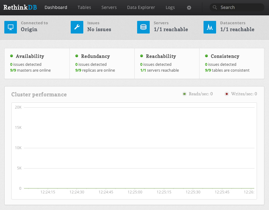
RethinkDB is a distributed document-store database that is focused on easy of administration and clustering. RethinkDB also features functionality such as map-reduce, sharding, multi-datacenter functionality, and distributed queries. Though the database is relatively new, it has been funded and is moving quickly to add new features and a Long Term Support release.
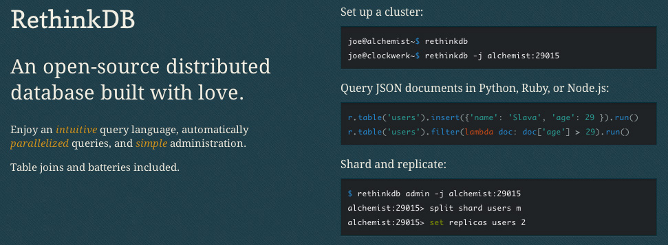
One major issue still remains with RethinkDB, however-- it's relatively difficult to secure properly unless you have security group or virtual network functionality from your hosting provider (a la Amazon Web Services Virtual Private Cloud, security groups, etc.). For example, RethinkDB's web administration interface is completely unsecured when exposed to the public Internet, and the clustering port does not have any authentication mechanisms. Essentially, this means that if you have an exposed installation of RethinkDB, anyone can join your database cluster and run arbitrary queries.
![]()
DigitalOcean, a great startup VPS provider, is a cheap means of trying out RethinkDB for yourself. The one issue is, they currently do not provide any easy way of securing clusters of RethinkDB instances. Unlike Amazon's security groups, which allow you to restrict traffic between specific instances, every DigitalOcean VPS can talk to each other over the private network1. Essentially, this would allow any DigitalOcean VPS in the data center to attach itself to your RethinkDB cluster, which is less than ideal.
Because of this, DigitalOcean is not a great host to run a cluster on if you're looking to get up and running quickly. There are ways around this, such as running a VPN (especially a mesh VPN like tinc) or manually adding each RethinkDB's IP address to your iptables rules, but this is a much more complicated setup than using another host that has proper security groups.
However, this doesn't mean that DigitalOcean is a bad host for your RethinkDB database-- especially if you're looking to try out the database or if you're just running a single node (which is fine for many different applications). In this tutorial, we'll go over how to properly setup a RethinkDB node and configure iptables to secure access to the database and web administration interface on DigitalOcean specifically, however this tutorial applies to any VPS or Dedicated Server provider.
Launching a Droplet
The first step you want to take is to sign up for DigitalOcean. If you sign up from this link, you will receive $10 in credit for free. This is enough to run a 512 MB droplet for two months, or a 1 GB RAM droplet for a single month2.
After registering, log into your account and create a new droplet3 on the dashboard. Enter a hostname, choose an instance size4, select the region closest to you5 for the lowest latency, and choose an operating system. For now, "Ubuntu 13.10 x64" or "Ubuntu 13.04 x64" are good choices unless you have another preference. If you wish to use an SSH key for authentication (which is highly recommended), select which key you'd like preinstalled on your Droplet. After you've selected all of the options you'd like to use, click the large "Create Droplet" button at the bottom of the screen.
Installing RethinkDB
Once your instance is launched, you're taken to a screen containing your server's IP address. Go ahead and SSH into it with either the root password emailed to you or with your SSH key if you've selected that option. You should be taken to the console for your freshly launched Ubuntu instance.
To actually install RethinkDB, you'll need to add the RethinkDB Personal Package Archive (PPA) with the command sudo add-apt-repository ppa:rethinkdb/ppa6.
Next, update your apt sources with sudo apt-get update, and then install the RethinkDB package with sudo apt-get install rethinkdb.
Configuring RethinkDB
As of now, you could run the command rethinkdb, and RethinkDB would start up and create a data file in your current directory. The problem is, RethinkDB does not startup on boot by default and is not configured properly for long term use.
To configure RethinkDB, we'll use a configuration file that tells RethinkDB how to run the database. Go ahead and copy the sample configuration into the correct directory, and then edit it:
sudo cp /etc/rethinkdb/default.conf.sample /etc/rethinkdb/instances.d/instance1.conf
sudo nano /etc/rethinkdb/instances.d/instance1.conf
Note that there are two commands above-- if there is a line break inside of the first command, ensure you copy and paste (or type out) the whole thing. This will open up the "nano" editor, though you can substitute this with any other editor you have installed on your VPS.
RethinkDB Configuration Options
The sample configuration file, as of RethinkDB v0.11.3, is included below for reference:
#
# RethinkDB instance configuration sample
#
# - Give this file the extension .conf and put it in /etc/rethinkdb/instances.d in order to enable it.
# - See http://www.rethinkdb.com/docs/guides/startup/ for the complete documentation
# - Uncomment an option to change its value.
#
###############################
RethinkDB configuration
###############################
Process options
User and group used to run rethinkdb
Command line default: do not change user or group
Init script default: rethinkdb user and group
runuser=rethinkdb
rungroup=rethinkdb
Stash the pid in this file when the process is running
Command line default: none
Init script default: /var/run/rethinkdb//pid_file (where  is the name of this config file without the extension)
pid-file=/var/run/rethinkdb/rethinkdb.pid
File path options
Directory to store data and metadata
Command line default: ./rethinkdb_data
Init script default: /var/lib/rethinkdb// (where  is the name of this file without the extension)
directory=/var/lib/rethinkdb/default
Log file options
Default: /log_file
log-file=/var/log/rethinkdb
Network options
Address of local interfaces to listen on when accepting connections
May be 'all' or an IP address, loopback addresses are enabled by default
Default: all local addresses
bind=127.0.0.1
The port for rethinkdb protocol for client drivers
Default: 28015 + port-offset
driver-port=28015
The port for receiving connections from other nodes
Default: 29015 + port-offset
cluster-port=29015
The host:port of a node that rethinkdb will connect to
This option can be specified multiple times.
Default: none
join=example.com:29015
All ports used locally will have this value added
Default: 0
port-offset=0
Web options
Port for the http admin console
Default: 8080 + port-offset
http-port=8080
CPU options
The number of cores to use
Default: total number of cores of the CPU
cores=2
bind
There are a couple of important entries we need to look at. First of all, is the bind address. By default, RethinkDB will only bind on the local IP address 127.0.0.1. This means that nothing outside of the machine the RethinkDB server is running on can access the data, join the cluster, or see the web admin UI. This is useful for testing, but in a production environment where the database is running on a different physical server than the application code, we'll need to change this.
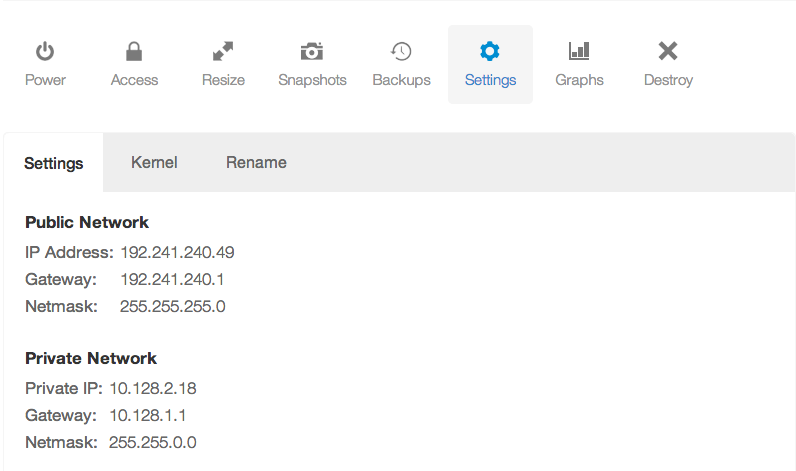
If you've launched an instance in a data center than supports private networking, you can change the bind option to your private IP address7 to start with. For example, if my private IP address is 10.128.2.18, you could use that value for the bind option. Also, make sure you remove the leading hash "#" symbol. This will uncomment the line and make the configuration active. If you want your database to be accessible to the public Internet, you may use your public IP address. Note that there are security ramifications of exposing your RethinkDB instance to the Internet, though we'll address them a little later.
If you wish to bind to all IP addresses-- including public IP addresses--you can use 0.0.0.0.
driver-port, cluster-port
The driver and cluster port options generally should not be modified unless you have a reason to do so. Modifying the ports just so that someone may not "guess" which ports you're using for the RethinkDB instance is not secure-- always assume that someone will find which ports you've configured, and secure your machine appropriately.
http-port
This option configures which port the HTTP administration UI will be accessible on. As with the driver-port and cluster-port, you can change this if the port is already in use by another service.
However, note that the admin UI is not secured in any way. Anyone with access to the admin panel can edit and delete machines from your cluster, and create, edit, and delete database tables and records. However, the admin UI will only be available on the bind address you've configured, so if you've left your bind address as 127.0.0.1, you will only be able to access the admin UI directly from the machine running RethinkDB.
join
The join address will not be used in this lesson, though this option configures which hostname or IP address and port your RethinkDB instance will attempt to join to form a cluster.
Once you've configured all of the options appropriately, you can save the configuration file and start the RethinkDB service:
sudo /etc/init.d/rethinkdb restart
Securing RethinkDB
Now you have RethinkDB running on your server, but it is completely unsecured if your bind address is anything but 127.0.0.1 or another non-accessible IP address. We need to do a couple of things:
- Restrict access to the cluster port so that no other machines can connect to the cluster
- Restrict access to the HTTP admin web UI so that malicious parties cannot access it
- Secure the client driver port so that RethinkDB requires an authentication key, and optionally restrict the port to only allow a specific set of IP addresses to connect
Using iptables to Deny Access to Ports
One method of restricting access to a specific port is through the use of iptables. To block traffic to a specific port, we can use the command:
iptables -A INPUT -p tcp --destination-port $PORT -j DROP
Simply change $PORT to the specific port you'd like to drop traffic for. For example to deny access to the cluster port (since we're not building a cluster of RethinkDB instances), we can use the command:
iptables -A INPUT -p tcp --destination-port 29015 -j DROP
This is assuming that you have not changed the default cluster communication port of 29015. Simply modify the above command to read the same as the "cluster-port" configuration entry if necessary.
Now, we'd also like to deny all traffic to the web administration interface that's located on port 8080. We can do this in a similar manner:
iptables -A INPUT -p tcp --destination-port 8080 -j DROP
However, this command denies access to the web administration UI for everyone-- including yourself. There are three primary ways we can allow you to access the web UI, from most secure to least secure--
- Use an SSH tunnel to access the interface
- Use a reverse proxy to add a username and password prompt to access the interface
- Drop traffic on port 8080 for all IP addresses except your own
Accessing the web administration UI through a SSH tunnel
To access the web administration UI through an SSH tunnel, you can use the following set of commands.
First, we must make the administration UI accessible on localhost. Because we dropped all traffic to the port 8080, we want to ensure that traffic from the local machine is allowed to port 8080.
sudo iptables -I INPUT -s 127.0.0.1 -p tcp --dport 8080 -j ACCEPT
The above command does one thing-- it inserts a rule, before the DROP everything rule, to always accept traffic to port 8080 from the source 127.0.0.1-- the local machine. This will allow us to tunnel into the machine and access the web interface.
Next, we need to actually setup the tunnel on your local machine. This should not be typed into your VPS console, but in a separate terminal window on your laptop or desktop.
ssh -L $LOCALPORT:localhost:$HTTPPORT $IPADDRESS
Replace the $LOCALPORT variable with a free port on your local machine, $HTTPPORT with the port of the administration interface, and $IPADDRESS with your VPS IP address. Additionally, if you SSH into your VPS with another username (e.g. root), you may append "$USERNAME@" before the IP address, replacing $USERNAME with the username you use to authenticate.
Once you've run the above commands, then you should be able to visit localhost:$LOCALPORT in your local web browser and see the RethinkDB web interface.
For a complete example example, the following exposes the RethinkDB administration interface on localhost:8081:
ssh -L 8081:localhost:8080 [email protected]
Using a Reverse Proxy
Because using a reverse proxy involves setting up Apache, Nginx, or some other software on your VPS, it is better to refer you to the official RethinkDB documentation on the subject. The setup steps aren't long, but out of the scope of this tutorial.
If you setup a reverse proxy, make sure you still allow local traffic to the web administration port.
sudo iptables -I INPUT -s 127.0.0.1 -p tcp --dport 8080 -j ACCEPT
Allowing Access for Your IP Address
One final method we'll go over for allowing access to the web UI from yourself is through whitelisting your IP address. This is done in a similar way to allowing local access to port 8080, except with your own IP address instead of 127.0.0.1. After finding your external IP address, you can run the following command on the VPS, replacing $IPADDRESS with the IP address:
sudo iptables -I INPUT -s $IPADDRESS -p tcp --dport 8080 -j ACCEPT
However, I would like to reiterate the insecurity of this method-- anyone with your external IP address, including those on your WiFi or home network, will have unrestricted access to your database.
Allowing Access for Client Drivers
Now that you've allowed yourself access to the web administration UI, you also need to ensure that the client drivers and your application can access the client port properly, and that the access is secured with an authentication key.
Setting an Authentication Key
First and foremost, you should set an authentication key for your database. This will require all client driver connections to present this key to your RethinkDB instance to authenticate, and allows an additional level of security.
On your VPS, you'll need to run two commands-- one to allow for local connections to the cluster port in order to run the administration command line interface, and the other to set the authentication key:
sudo iptables -I INPUT -s 127.0.0.1 -p tcp --dport 29015 -j ACCEPT
Next, we'll run the RethinkDB command line tool:
rethinkdb admin --join 127.0.0.1:29105
This will bring you into the command line administration interface for your RethinkDB instance. You can run a single command, set auth $AUTHKEY, replacing $AUTHKEY with your authentication key.
After you're done, you can type exit to leave the administration interface, or you can take a look at the RethinkDB documentation to see other commands you can run.
If you recall, at this point, the client port (by default, 28105) is still accessible from the public Internet or on whatever interfaces you've bound RethinkDB to. You can increase security to your database by blocking access (or selectively allowing access) to the client port using iptables and commands similar to those listed earlier in the tutorial.
Further Reading
Now that you've setup RethinkDB and secured it using iptables, you can access the administration UI and connect to your instance using a client driver with an authentication key. Though we've taken basic security measures to run RethinkDB on DigitalOcean, it's still recommended to take additional precautions. For example, you may wish to either use a mesh VPN such as tinc to encrypt the database traffic between your clustered instances, if you choose to expand your cluster in the future.
It's also worth reading over the fantastic RethinkDB official documentation for additional instruction on configuring your instance or cluster, or on how to use the administration interface or the ReQL query language8.
- Private networking is only supported in specific data centers at this time, including the NYC 2, AMS 2, and Singapore data centers. ↩
- DigitalOcean's pricing page has a switch that lets you see the hourly or monthly price of their servers. The monthly price is the maximum you can pay per month for that specific server, even if the number of hours in a month times the hourly price is more. For example, a 512 MB VPS is $0.007 per hour or $5 a month. The maximum days in a single month is 31, times 24 hours, times $0.007 per hour equals about $5.21. However, because the monthly price of the VPS is $5, you only pay that amount. ↩
- DigitalOcean calls their VPS servers "Droplets". This is similar to Amazon's "Instance" terminology. ↩
- I highly recommend at least using a 1 GB Droplet if you're planning on actually using RethinkDB or trying it out with large amounts of data. If you just want to check out RethinkDB and see how it works, you can start out with a 512 MB Droplet just fine. ↩
- Remember, you must select a region with private networking (such as NYC 2, AMS 2, or Singapore) if you wish to create a cluster and use the private IP address for cluster communication. This way, you're not billed for cluster traffic. However for a single node, you may choose any data center you'd like. ↩
-
Getting an error saying you do not have the command "add-apt-repository"? If you're running Ubuntu 12.10 or newer, then install it with
sudo apt-get install software-properties-common. Ubuntu versions older than 12.10 should use the commandsudo apt-get install python-software-properties. ↩ -
You can find your private IP address (or public IP address) in your DigitalOcean control panel, under the Droplet you're running, and in the settings tab:
 ↩
↩
- I realize this is redundant. ↩
Nowadays, it's rare that a technology direct from science fiction makes it to a household appliance before your smartphone or laptop. For example, fingerprint scanners, common in some industrial and high-security applications, finally appeared in several laptops, the Motorola Photon, and most recently the iPhone 5S. But wireless charging has been integrated into electronic toothbrushes for over a decade, and yet we've seen a minimal number of consumer devices integrated with the technology.
In 2009, Palm announced the Palm Pre smartphone based on WebOS and the Touchstone inductive charger. The phone, while not a huge success, ultimately saw the inclusion of the Touchstone wireless back cover with future iterations of the device. However once the Palm Pre faded into obscurity along with its sibling devices, the concept of built-in wireless charging faded with it.

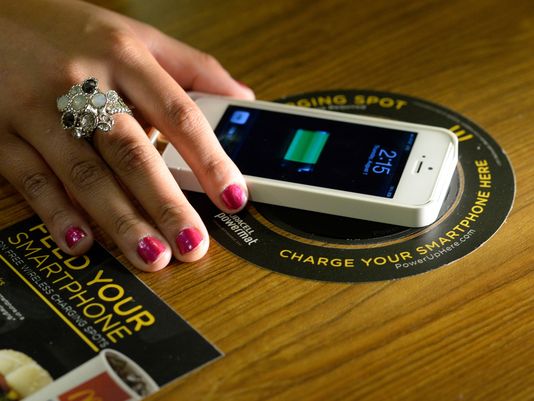
Last year, Starbucks continued their rollout test of the Powermat wireless charging standard to several Silicon Valley stores after trialing the tech in Boston. This move is fairly controversial, given the battle between the Power Matters Alliance (the owner of the Powermat technology), the Wireless Power Consortium's Qi charging standard (pronounced "Chee"), and the Alliance for Wireless Power's Rezence. To add to the wireless-power drama, Powerkiss, a company that originally produced Qi wireless charging dongles for phones, flipped between standards entirely when it was acquired by Powermat Technologies at the beginning of 20131.
On one front, the Power Matters Alliance appears to be winning-- they have integrations with several Starbucks stores around the United States, including those from the trials in San Jose and Boston, as well as several highly trafficked areas like Madison Square Garden2. Additionally, in November, The Coffee Bean & Tea Leaf announced that their LA stores would also have integrated Duracell Powermat chargers3. While the actual number of places that Powermat technology is available is quite small in contrast to other technologies such as USB charging ports, in comparison to Qi, Powermat is the clear winner.
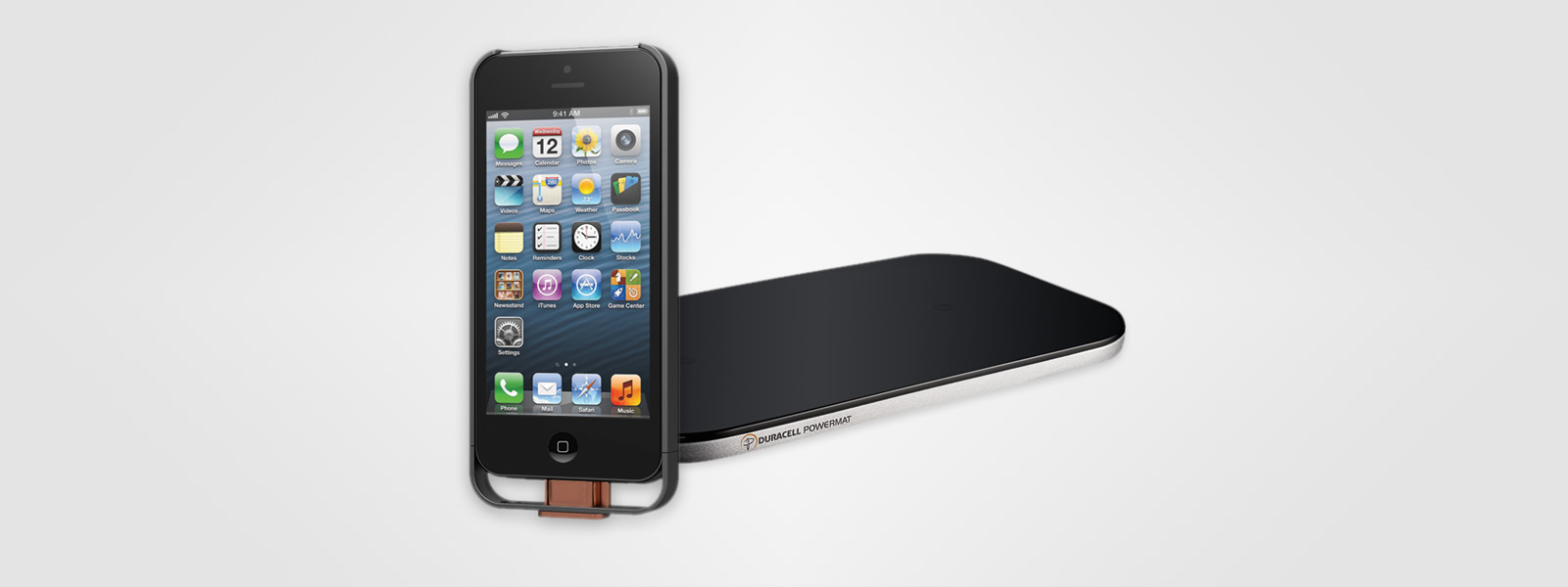
However, in order to use these charging hotspots, you must own a Powermat compatible device because none of the current standards are compatible. But there's a catch-- there are, as of publication, no smartphones or tablets with built in Powermat technology. This is a significant downfall of the technology and in order to use it, you must purchase an often bulky accessory to enable wireless charging. What's worse is that there are few cases on the market that do not fit phones other than those from Apple, HTC, Samsung, or Blackberry. As a bonus, the cases that are available, with the exception of those for the iPhone, are usually only manufactured for older models of phones.
As a result, even though there are several large venues with Powermat stations installed, you'll see few of the chargers in use. Additionally, those that do take advantage of the Powermat hotspots will have something in common-- they will be using a third-party case, almost certainly sold by Duracell Powermat, to have the privilege to use the technology.
Where does that leave Qi, the second large wireless power standard?
Unlike Powermat, Qi has refrained from making a big splash in the media by deploying integration trials around the world. Where Qi excels is its integrations with hardware vendors, which arguably makes the Wireless Power Consortium's standard more appealing to consumers than Powermat.
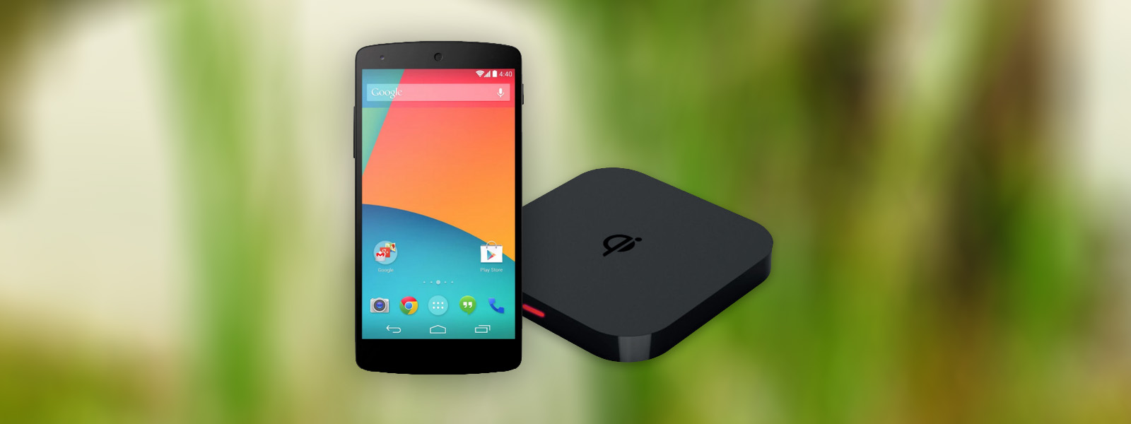
For example, Google, Nokia, and Samsung have recently released phones with Qi support or integration, including the Google Nexus 4, Nexus 5, Nexus 7, and Nokia Lumia 820. Additionally, Samsung's Galaxy Note 3 and Galaxy S4 include support for Qi inserts and backplates.
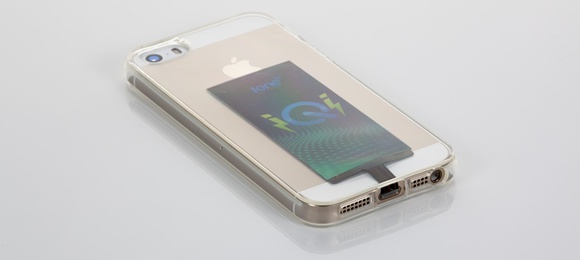
Yet, one phone remains problematic-- the Apple iPhone. Without a way to change the backplate or battery of the device, it's nearly impossible to seamlessly integrate the Qi charging standard with the phone without Apple's official support. A clever exception to this appeared on Indiegogo at the end of 2013-- the iQi. This slim adapter utilizes a thin ribbon cable to attach to the Lightning port at the bottom of the iPhone, which allows you to tuck the wireless power coil into your soft case without having extra bulk at the bottom of your device.
With one of the largest obstacles to widespread wireless charging use--Apple--nearly solved using Qi technology, why is it that Powermat still is largely considered a winner by the media in the wireless power war? The answer can be found in the format war between Toshiba's HD-DVD and Sony's Blu-ray format: marketing and integration. Unlike Toshiba, Sony had an extremely important piece of hardware that was Blu-ray compatible-- the Playstation 3 game console. On top of that, Sony's ability to produce content for the Blu-ray format made it nearly impossible for Toshiba's HD-DVD to keep pace. It was ultimately Warner Bros. dropping HD-DVD for its content that caused the HD-DVD format to die off, but only after a long TV marketing battle between Blu-ray and HD-DVD that resulted in Toshiba's standard being killed off4.
The Power Matters Alliance clearly is attempting to win the wireless charging war through sheer brute force. Placing Powermat chargers in the consumer's face through McDonalds and Starbucks has resulted in glowing press releases and the illusion that Powermat is vastly superior. It's smart marketing, playing to the dream of being able to set your phone on a table while you're getting coffee and have it charge, but ultimately it's deceiving to the consumer when this reality is years away from fruition.
Though the media primarily focuses on the war between the Power Matters Alliance and the Wireless Power Consortium, there's a third standard that has emerged out of the battleground-- the Alliance for Wireless Power, or "A4WP". Rather than focusing on electromagnetic induction, the primary method of power transfer current Qi and Powermat chargers use, A4WP's Rezence technology uses magnetic resonance to deliver power across distances. An advantage of magnetic resonance charging technology is the ability to provide remote electricity beyond a simple charging mat, potentially throughout whole rooms or venues. The idea of walking into your living room or bedroom and having your phone, still in your pocket, begin to charge is an idea straight out of science fiction. Potential future applications of magnetic resonance power transfer include lightbulbs or other small appliances that can be fixed anywhere in the room, without the need for wires leading to them. Even more exciting, for some home owners, is the prospect of having wirelessly charged smoke detectors that never run out of battery power.

However, A4WP faces the same issues present in the battle between Powermat and Qi-- adoption. In fact, A4WP's Rezence hasn't been developed into a product at all, and early-2014 is the earliest anyone will be able to get their hands on the technology. Fortunately, the smaller A4WP isn't the only standards group to consider magnetic resonance-- Qi plans to incorporate a backwards compatible magnetic resonance based charging platform in a future version of the standard5 and WiTricity's membership to the Power Matters Alliance also indicates magnetic resonance as future direction for Powermat6. The magnetic resonance technology, demonstrated at CES 2014 by the A4WP, is a vital step towards widespread adoption of wireless charging. While traditional induction chargers often require careful placement on a charging pad, the second generation of Qi mats, for example, can transmit power over larger distances and with higher efficiency-- up to 80%5.
But recent news7 indicates that the Alliance for Wireless Power and the Power Matters Alliance have signed a preliminary agreement to work with each others' technologies. This, along with PMA's adoption of WiTricity, will increase difficulties for Qi. While there were previously three competing standards, there are now two.
Ultimately, the war will be won by consumer awareness and adoption-- not technology. While Qi has a head start on integration with phones, A4WP's merger with PMA's standard may lead to interesting solutions in the marketplace. If PMA-A4WP can get a product out in the market--and soon--Qi may be dead in the water.
The Power Matters Alliance currently has over a hundred members 8, including Samsung Electronics, Duracell Powermat, BlackBerry Limited, HTC, Qualcomm, Starbucks, Sony, and others.
The Wireless Power Consotrium has over two hundred members 9, including Samsung Electronics, Energizer, Motorola Mobility, HTC, and others.
- http://www.crunchbase.com/company/powerkiss ↩
- http://www.thegarden.com/duracellpowermat.html ↩
- http://www.prnewswire.com/news-releases/duracell-powermat-launches-wireless-smartphone-charging-pilot-program-with-the-coffee-bean--tea-leaf-231558701.html ↩
- http://www.pcmag.com/article2/0,2817,2264994,00.asp ↩
- http://www.wirelesspowerconsortium.com/blog/35/resonant-qi-charger ↩ ↩
- http://www.powermatters.org/menuless/260-witricity-joins-pma ↩
- http://www.theverge.com/2014/2/11/5398066/a4wp-and-pma-merge-tech-to-win-wireless-charging-war ↩
- http://www.powermatters.org/members ↩
- http://www.wirelesspowerconsortium.com/member-list/ ↩
The past week I've been busy with a small project of mine that I've been planning on getting off the ground since March of last year-- Jekyll Themes. Jekyll Themes is a repository for authors to list themes and pre-built templates for the Jekyll static site generator.
While I've previously written about how to create a Jekyll website from scratch, a lot of developers or bloggers don't necessarily want to spend the time designing or creating a website from a blank canvas. Thankfully, there are a lot of great themes out there, but many of theme are spread throughout individual GitHub pages and projects. Hopefully, with Jekyll Themes, the themes scattered across the internet can be consolidated into a single listing where they are tagged by their color scheme, responsive-ness, or other attributes.
Kraken is a web service designed to perform a similar function to desktop based applications such as ImageOptim. For as little as $7 a month (for half-a-gigabyte of images processed a month), you can have Kraken.io process your images and compress them. Alternatively, you can use their free web service by uploading files individually. The service works significantly faster than ImageOptim because of the powerful servers that they use to crunch your images.
But, how does it compare to the desktop equivalent?
The quick answer is, "it depends." Minimally, Kraken's optimization is nearly as good as ImageOptim, or equal to it. For example, Kraken configured with "Lossless" settings saved an average of 34% off of the original file size off of several PNG images, whereas ImageOptim saved 35.1%. The difference is relatively minor.
In the JPG arena, Kraken initially appears to perform significantly better than ImageOptim, saving 47% of the original file size versus ImageOptim's 34%. However, Kraken obtains these savings by reducing the image quality setting of the JPG. Conversely, ImageOptim has a maximum quality setting, but will not reduce the quality beyond this user set number. Instead, ImageOptim performs optimizations with the file format itself to achieve a lossless compression. This is similar in behavior to Kraken's ability to losslessly compress JPG files.
For example, the following two images were compressed by Kraken's web service-- one losslessly, one with lossy compression. As you can see, Kraken actually does a very good job with its compression in this case and does not introduce any significant artifacts into the image, despite the 73% savings over the original image.
 |
 |
| 380kb ~21% Savings |
120kb ~74% Savings |
To the casual observer, there is virtually no difference between the two images above. The most noticeable area where artifacts are introduced is around the lights hanging across the road, though it is a relatively minor side effect to shaving off nearly 3/4 of the original file size. You can see this yourself by clicking on the images above and opening the full sized images in new browser tabs, zooming in, and then switching back and forth between tabs.
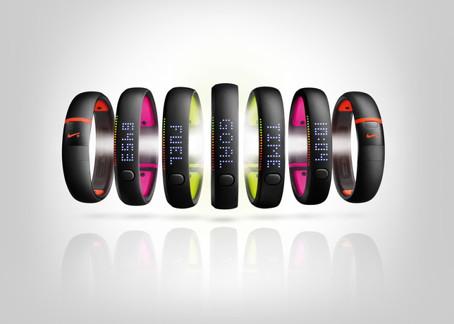
However, this isn't necessarily true for all images. For example, the following Nike Fuelband+ SE press images have been run through Kraken-- both with lossless and lossy compression.
 |
 |
| 47kb ~4% Savings |
16kb ~67% Savings |
The lossy compressed image has a significant number of artifacts around the face of the band, resulting in an image that does not look optimal. Interestingly, the lossless compressed image from Kraken is the same size as the image produced by ImageOptim-- likely because Kraken's using the same optimization backend as ImageOptim, with some additional fine tuning.
A point to note is that Kraken does not accept images above 1mb in size for the free web interface, or above 8mb for any of their paid plans. This may be an issue when you're attempting to compress photographs straight off of camera, or large PNG infographics and such. You will have to shrink the files by hand locally prior to using the Kraken web service. In contrast, desktop based apps such as ImageOptim have no limitation on the file size in practice.
Another primary issue with Kraken is the lack of ability to change quality settings. This is especially a problem with lossy compression, where the quality of the image is degraded. It'd be ideal to have a slider to determine what quality to file size ratio is desired.
Kraken's paid plans have several additional features over the free web interface, such as the ability to optimize images by pasting a URL, as well as scan an entire website and optimize all images. Additionally, Pro users have the ability to save images in their Kraken Cloud Storage account.
In conclusion, Kraken is a great web service to replace existing desktop apps such as ImageOptim. Pro users also have the neat ability to use the API, so that images can be optimized on a website's deployment. As long as you're happy with the default settings Kraken provides, however, it's a great service and will help you maintain high performance on your own website.
When I first started my blog, I used Tumblr. I didn't choose it for the social integration or community, but rather to offload the management of servers to a third party.
My decision was justified when one of my posts, Captchas Are Becoming Ridiculous, hit the top spot of Hacker News. Over the course of two days, over 22,000 visitors visited my post. It's common to see the servers of front page Hacker News posts struggle or even go down entirely due to the surge of traffic, but thanks to Tumblr, my website stayed online the entire time.
But while Tumblr was resilient to sudden surges in traffic, the service has had its struggles and periodically went offline. There's several huge, day long gaps in my Analytics-- a sign I need to move to another platform.
Moving to Jekyll
Moving to Jekyll gave me the opportunity to give my entire website a facelift and bring the design of both my portfolio and blog in line. Building the new theme, which is based on Bootstrap, and learning how to use the Liquid template system and Jekyll took less than two working days.
Like before, I'm not managing my own servers. While I love Heroku, I also wanted to be able to scale and manage a sudden spike in traffic. Because this website is now static HTML, a single Heroku instance would probably have been fine, but I took the opportunity to experiment with some new technology.
Amazon S3 and CloudFront
This Jekyll site is hosted on Amazon S3 and the Amazon CloudFront CDN. As a result, it's like my website and blog is being hosted on multiple servers around the United States and Europe rather than a single instance as it would have been if I hosted with Heroku. This allows for the website to be blazing fast, no matter where my visitors are on the planet.
CloudFront has a limit of nearly 1,000 megabits per second of data transfer and 1,000 requests per second by default. If I were to need additional capacity, I could always request an increase, but at these maximum rates, I would be handling over 300 TB a data month and 2.6 billion page views. Somehow I don't think I'll ever hit that.
Performance Numbers
By moving to CloudFront, my blog received a massive performance upgrade. According to Pingdom's tool, my blog loads faster than 97% to 100% of websites, depending on the page visited.
Home Page
Prior to adding my portfolio to the home page (the images are extremely large and unoptimized: ~1.9 mb total, and I will be reducing them in the future), I was getting load times of 160ms from the Amsterdam server. Without Javascript, the load time decreased to a blistering 109ms-- literally as fast as a blink of an eye. By Pingdom's numbers, this meant my website was faster than 100% of websites. From New York, with Javascript, the website loaded in approximately 260ms. Not bad, but significantly slower.
I am currently evaluating the trade off of having jQuery and the Bootstrap Javascript file simply for the responsive collapsable menu (try resizing your window and look at the menu-- clicking the icon will toggle the menu, which is powered by jQuery). jQuery is approximately 30 kb, and I use very little of its functionality as it stands. The Bootstrap script isn't as bad, weighing in at 2 kb (I stripped everything but the collapsable plugin out). I'll likely leave it in because it will give me flexibility in the future, but I really wish Zepto worked with Bootstrap since it is a third of the size of jQuery.
With images, my page loads in approximately 370ms-- pretty good for how large the images are. It takes over 250 ms for the fastest image to download, so if optimized, I'm confident I'll be able to decrease the load time to under 250ms once again.
Blog Home Page
The blog home page has no images-- only the Elusive web font for the social media icons in the sidebar. The font weighs in at ~225 kb and adds nearly 50ms to the load time, for a total of approximately 300ms.
Blog Content Page
This is the most important page-- the majority of visitors to my website arrive from Google and land on one of these pages, so it must load quickly.
Thanks to Disqus, I'm seeing load times of 650ms, which is significantly worse than any other page on my website. Unfortunately, there's nothing I can do about this, and I feel that the ability to have a discussion is important and worth the extra load time.
Causes of Latency
The biggest cause of latency is external media, such as large photographs and the Elusive web font. To further optimize the page, I'll have to remove the Bootstrap icon set and the web font, opting for retina-resolution images for the social media buttons. To prevent additional requests, I can inline-embed these images into the CSS using base 64 encoding or use a sprite sheet.
Disqus also contributes significantly and causes over 70 different requests to an external server to load stylesheets and content. When compared to my website, which only makes 7 requests (including all web fonts and Google Analytics), you can see why the load time is significantly higher on blog articles with comments.
It's also important to note these numbers are from Pingdom's test-- a server with very high bandwidth. It will be significantly slower for those on 3G connections, but the gains will also be apparent.
Optimizations
These load times were't achieved by chance, but rather a large build process I wrote in a Makefile.
After running make, Jekyll builds the website. I use the Jekyll Asset Pipeline to combine all of my Javascript and CSS files into single, minified scripts and stylesheets. The Javascript is set to defer as to not block the page render.
After this is done, CSS is compressed using YUI and all HTML, Javascript, and CSS is GZipped.
Finally, using s3cmd, all of the GZipped content is synced to Amazon S3 with the proper headers (content-encoding as well as cache-control: maxage) and the CloudFront distribution is invalidated. Unfortunately, S3 doesn't allow for the Vary: Accept-Encoding header to be set (technically, this is right since the server doesn't actually vary GZipping based on browser capabilities), so many page speed tests will complain about this.
After the invalidation propagates, the website is then viewable with the new content.
By offloading all content processing (and GZipping) to my computer during build time versus during the actual request, as CloudFlare or another caching layer might do, we can shave off a few milliseconds.
I'm extremely happy with this new setup and it also gives me new flexibility I didn't have before with Tumblr, including the ability to enhance some of my articles with cool media and custom, per article layouts (a la The Verge). When I complete one of these articles, I'll be sure to do another writeup showing how it's done.
While I've previously gone over development environments using Vagrant and Puppet, recent advancements in LXC container management (see: Docker) and applications that have popped up using this technology have made deploying to staging or production environments easier-- and cheaper.
Heroku, a fantastic platform that allows developers to focus on code rather than server management, has spoiled many with its easy git push deployment mechanism. With a command in the terminal, your application is pushed to Heroku's platform, built into what is known as a "slug", and deployed onto a scalable infrastructure that can handle large spikes of web traffic.
The problem with Heroku is its cost-- while a single "Dyno" per application, which is equivalent to a virtual machine running your code-- is free, scaling past a single instance costs approximately $35 a month. Each Dyno only includes half a gigabyte of RAM as well, which is minuscule compared to the cost-equivalent virtual machine from a number of other providers. For example, Amazon EC2 has a "Micro" instance with 0.615 gigabytes of RAM for approximately $15 a month, while $40 a month on Digital Ocean would net you a virtual machine with 4 gigabytes of RAM. But, with Heroku, you pay for their fantastic platform and management tools, as well as their quick response time to platform related downtime-- certainly an amazing value for peace of mind.
But, if you're only deploying "hobby" applications or prefer to manage your own infrastructure, there's a couple of options to emulate a Heroku-like experience.
Docker, LXC, and Containers
If you've been following any sort of developer news site, such as Hacker News, you've likely seen "Docker" mentioned quite a few times. Docker is a management system for LXC containers, a feature of Linux kernels to separate processes and applications from one another in a lightweight manner.
Containers are very similar to virtual machines in that they provide security and isolation between different logical groups of processes or applications. Just as a hosting provider may separate different customers into different virtual machines, Docker allows system administrators and developers to create multiple applications on a single server (or virtual server) that cannot interfere with each other's files, memory, or processor usage. LXC containers and the Docker management tool provide methods to limit RAM and CPU usage per container.
Additionally, Docker allows for developers to export packages containing an application's code and dependencies in a single .tar file. This package can be imported into any system running Docker, allowing easy portability between physical machines and different environments.
Dokku and Deployment
Containers may be handy for separation of processes, but Docker alone does not allow for easy Heroku-like deployment. This is where platforms such as Dokku, Flynn, and others come in. Flynn aims to be a complete Heroku replacement, including scaling and router support, but is not currently available for use outside of a developer preview. Conversely, Dokku's goal is to create a simple "mini-Heroku" environment that only emulates the core features of Heroku's platform. But, for many, the recreation of Heroku's git push deployment and basic Buildpack support is enough. Additionally, Dokku implements a simple router that allows you to use custom domain names or subdomains for each of your applications.
Digital Ocean is a great cloud hosting provider that has recently gained significant traction. Their support is great and often responds within minutes, and their management interface is simple and powerful. Starting at $5 per month, you can rent a virtual machine with half a gigabyte of RAM and 20 gigabytes of solid state drive (SSD) space. For small, personal projects, Digital Ocean is a great provider to use. Larger virtual machines for production usage are also reasonably priced, with pricing based on the amount of RAM included in the virtual machine.
Another reason why Digital Ocean is great for Docker and Dokku is due to their provided pre-built virtual machine images. Both Dokku 0.2.0-rc3 and Docker 0.7.0 images are provided as of this publication, and in less than a minute, you can have a ready-to-go Dokku virtual machine running.
If you don't already have a Digital Ocean account, you can get $10 in free credit to try it out through this link. That's enough for two months of the 512 MB RAM droplet, or a single month with the 1 GB RAM droplet.
Setting Up the Server
After you've logged into Digital Ocean, create a new Droplet of any size you wish. The 512 MB instance is large enough for smaller projects and can even support multiple applications running at once, though you may need to enable swap space to prevent out-of-memory errors. The 1 GB Droplet is better for larger projects and runs only $10 per month. If you are simply experimenting, you only pay for the hours you use the instance (e.g. $0.007 an hour for the 512 MB Droplet), and Digital Ocean regularly provides promotional credit for new users on their Twitter account. If you follow this tutorial and shut down the instance immediately afterwards, it may cost you as little as two cents. You can choose any Droplet region you wish-- preferably one that is close to you or your visitors for the lowest latency. Digital Ocean currently has two New York, two Amsterdam, and one San Francisco datacenter, with Singapore coming online in the near future. Droplets cost the same in each region, unlike Amazon or other providers.
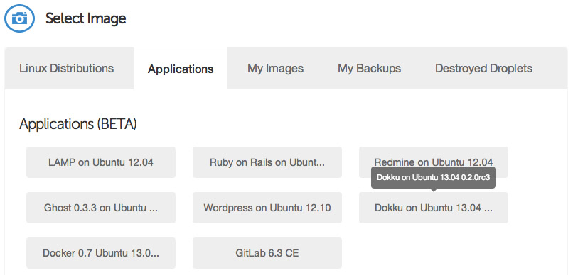
Under the "Select Image" header on the Droplet creation page, switch to the "Applications" tab and choose the Dokku image on Ubuntu 13.04. This image has Dokku already setup for you and only requires a single step to begin pushing applications to it.
Select your SSH key (if you haven't already set one up, you will need to do so before launching your Droplet), and then hit the big "Create Droplet" button at the bottom of the page. You should see a progress bar fill up, and in approximately one minute, you'll be taken to a new screen with your Droplet's information (such as IP address).
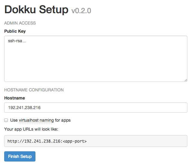
Take the IP address, and copy and paste it into a browser window. You'll see a screen popup with your SSH public key, as well as some information pertaining to the hostname of your Dokku instance. If you specified a fully qualified domain name (e.g. apps.example.com) as your Droplet's hostname when you created it, the domain will be automatically detected and pre-filled in the setup screen. If this is the case, you can just check the "use virtualhost naming" checkbox and hit "Finish" and continue to setup your DNS.
However, if you entered a hostname that is not a fully qualified domain name (e.g. apps-example), you'll just see your IP address in the Hostname text box. Enter the fully qualified domain name that you'll use for your server, select the "virtualhost naming" checkbox, and click "Finish Setup". For example, if you want your applications to be accessible under the domain apps.example.com, you would enter apps.example.com in the "Hostname" field. Then, when you push an app named "website", you will be able to navigate to website.apps.example.com to access it. You'll be able to setup custom domains per-app later (e.g. have www.andrewmunsell.com show the application from website.apps.example.com).
In any case, you'll be redirected to the Dokku Readme file on GitHub. You should take a minute to read through it, but otherwise you've finished the setup of Dokku.
DNS Setup
Once your Droplet is running, you must setup your DNS records to properly access Dokku and your applications. To use Dokku with hostname-based apps (i.e. not an IP address/port combination), your DNS provider must support wildcard DNS entires. Amazon Route 53 is a relatively cheap solution that supports wildcard DNS entires (approximate cost of $6 per year), while Cloudflare (free) is another.
To properly resolve hostnames to your Droplet running Dokku, two A DNS records must be set:
A       [Hostname]      [Droplet IP address]
A       *.[Hostname]    [Droplet IP address]
For example, if your Droplet is running with a hostname of apps.example.com and you wish to use apps under *.apps.example.com, you would use the following DNS records:
A       apps.example.com        [Droplet IP address]
A       *.apps.example.com      [Droplet IP address]
For more information on DNS, see various resources available to you on the Internet, including Cloudflare's documentation on the subject.
Deploying Code
Dokku allows for many of your existing apps, including those built for Heroku, to immediately run on your own Dokku instance. Dokku uses a package called a "Buildpack" to define how your application is packaged for deployment. For example, the PHP Buildpack defines behavior to pull down compiled versions of Apache, PHP, and other dependencies, and perform basic setup to run a PHP application. Similarly, the Node.js Buildpack retrieves dependencies by fetching the Node.js binary, NPM, and all of your application's dependencies as defined in package.json.
To illustrate how Dokku works, we'll create a simple Node.js application that defines dependencies and responds to HTTP requests with "Hello, World!"
Create a new directory on your computer with the following files and contents:
/package.json
{
    "name": "dokku-demo-application",
    "version": "1.0.0",
"private": true,

"engines": {
    "node": ">=0.10.0",
    "npm": ">=1.3"
},

"dependencies": {
    "express": "~3.0"
}

}
/server.js
var PORT = process.ENV.PORT || 8080;
var express = require("express");
var app = express();

app.use(app.router);

app.use(express.static(__dirname + "/public"));
app.get("/", function(req, res){

res.send("Hello, World!");

});
app.listen(PORT);
/Procfile
web: node server.js
This is a simple example Express application that creates a single HTTP GET route--the root directory /--and responds with a single phrase. As you can see, this Dokku application's structure mirrors Heroku's requirements. The Procfile defines a single "web" command to be started. All Dokku Buildpacks will normally ignore other process types defined in the Procfile.
After you've created the files, create a Git repository using a Git GUI such as Tower or SourceTree, or the command line, and commit the previously created files. You'll also need to define a remote repository-- your Dokku instance. For example, if your Dokku instance was hosted at apps.example.com, you would define an remote of [email protected]:app-name. You can modify the app-name as desired, as this will correspond to the subdomain that your application will be served from.
Once you've added the remote, push your local master branch to the remote's master. If everything is setup correctly, you'll see a log streaming in that indicates Dokku's current task. Behind the scenes, Dokku creates a new Docker container and runs the Buildpack's compilation steps to build a Docker image of your application. If the build succeeds, your application is deployed into a new container and you will are provided with a URL to access your application at. In this example, the application would be accessible at http://app-name.apps.example.com/ and will display "Hello, World!"
Using a Custom Domain
While your application is accessible at the subdomain provided to you after your application is deployed, you may also want to use a custom domain for your application (e.g. api.example.com). You can do this in two ways-- use the fully qualified domain name desired for your application's repository name, or edit the generated nginx.conf file on your Dokku server to include your domain name.
The first method is quite simple-- instead of pushing your repository to [email protected]:app-name, you simply name your app based on your domain. For example: [email protected]:api.example.com.
Alternatively, you can SSH into your Dokku instance using the IP address or hostname and the root user to modify the nginx.conf file for your application. Once you're SSH-ed into your instance, simply change directories to /home/dokku/[application name] and edit the nginx.conf file. For example, the application we pushed ("app-name") would be found at /home/dokku/app-name. To add your own domain, simply add your custom domain name to the end of the server_name line, with each domain separated by spaces. Changes to the domain in this file will not be overwritten on the next git push.
Going Further
As you can see, Dokku is an incredibly powerful platform that mimics Heroku very closely. It provides the basics needed for deploying an application easily, and allows for quick zero-downtime deployments. With a host like Digital Ocean, you can easily and cheaply host multiple applications. Careful developers can even deploy to a separate "staging" application before pushing to the production app, allowing for bugs to be caught before they're in the live environment.
In February of 2012, Nike released the Nike+ FuelBand-- a sleek, discreet wristband that tracks your everyday activities and awards you "NikeFuel points", a proprietary metric designed to consolidate different types of activities into a universal standard. With competitors such as FitBit already gone through several iterations of high-tech wearable pedometers, Nike needed to develop a device that worked well, and looked good.
The original FuelBand received mixed reviews, with many users complaining about reliability over time. Despite the hardware issues, Nike's FuelBand was a solid entry into the "Quantified Self" movement that seems to be increasing in popularity.
Fast forward a year and a half, and the second generation Nike+ FuelBand SE device is nearly available for public consumption. But, with only small improvements in tracking and an update to the Bluetooth 4.0 standard, Nike has missed a valuable opportunity to differentiate themselves in the expanding field of wearable electronics, and instead spent over a year creating a minor iteration of its existing device.
Wearable Computers
Wearable technology is becoming more popular, with terms such as "smartwatch" and "activity tracker" skyrocketing in popularity over the last two years.
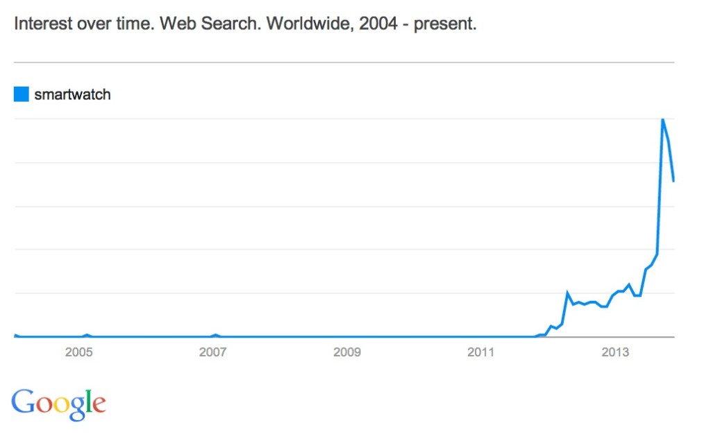
![]()
Companies such as FitBit, Jawbone, Motorola, and others have been producing new generations of bands, clips, and watch-like devices to track fitness and activities. Even outside of activity trackers, smart-watches are becoming less of a sci-fi, geek toy and instead are now practical and affordable thanks to companies such as Pebble, Metawatch, and Samsung.
While the entries currently on the market are still relatively young and reflective of their first generation nature, the important fact is that the general public is becoming aware of their availability. Samsung's recent push in advertising the Galaxy Gear portrays the device as one straight out of a science fiction movie, and is a notable example of the initiative to increase mass market appeal of these wearable devices.
Yet, some people aren't ready to consider a smart watch a socially acceptable accessory with their sometimes bulky form factor. While a wrist band or activity tracker clip is discreet, a Pebble or Galaxy Gear watch will often stick out like a sore thumb. I personally have a Pebble, being a Kickstarter backer, and often get comments on my watch for its unique looks-- even if others are unaware of its full capabilities. Because it doesn't strictly look like a traditional, round watch, it's difficult to hide, and while my geeky personality is complimented by a device such as the Pebble, others aren't quite as ready to put one on.
Hiding in Plain Sight
This is an area where Nike nailed the execution of the FuelBand-- it's design is stunning. You, or any passer-by, will barely notice the FuelBand's simplistic form. When off, the band has no visible lights or screen and has a single button on its face. It's one, seemingly continuous black band of matte material, but when the screen lights up out of the blank face the FuelBand looks futuristic, though not in a tacky way. If you're more inclined to make the FuelBand's presence known, the original had several other color options to choose from, including a clear plastic casing that reveals the inner electronics.
With the second generation, Nike does nothing to alter the overall look of the device, thankfully. Though the clear band is now retired, you have the option of several accent colors that line the inside of the wrist band. The effect is subtle, and the color only visible in the moments where you turn your wrist just the right way. The minimalistic design makes the suitable for anyone to wear all-day-- it's gender neutral, doesn't have a significant "geek factor," and yet is still functional.
Afraid of Change
Nike, at its core, is a fitness company. It produces athletic gear, from shoes to sports equipment, and sponsors a multitude of sports teams across different areas. In the realm of technology, Nike's reach is limited-- Apple has had a long history of Nike + iPod sensor integration, which is a small sensor that fits in the shoe and sends fitness data to an iPhone, iPod, or other Nike+ integrated device, but apart from the Nike+ sensor, their only other significant technology product is the Nike+ FuelBand.
These electronic devices and apps are designed to do what Nike knows best-- track fitness activities. There's nothing wrong with focus, but when you're a primary competitor in a fast-paced field such as wearable technology, your product has to be rock solid and innovative. Arguably, Nike is being outpaced in this area by other, smaller companies that are willing to accept some risk for the chance of differentiation.
A recent competitor I frequently refer to is the FitBit Force. Arguably, the Force is the product closest to the FuelBand-- it's a relatively sleek and discreet wristband that functions as a simple watch and includes wireless syncing over Bluetooth 4.0. One significant differentiator is the capabilities of the small screen on the Force-- not only can is display the time, but when paired with an iOS 7 phone or device, caller ID information is displayed. This small feature is one enjoyed by many smart-watch users, but is relatively new to those unwilling to wear one of the geekier devices.
Nike's FuelBand had the perfect opportunity to steal this functionality and improve on it with this recent iteration of the device. Not only would the FuelBand have the ability wrangle in the fitness gurus that enjoy the ability to track activity and sleep activity 24/7, but it would appeal to those individuals who'd like the convenience of glance-able information on their wrist, minus the bulk of a watch.
This same concept could have been expanded to other applications as well. Imagine a push notification API, similar to that of the Pebble watch, that allows your Withings scale to subtly remind you to record your weight at the end of the day, or allows Argus or another life tracker to suggest you drink a glass of water. After all, Nike already has a developer API that reads data from the FuelBand-- why not make it read and write capable?
Nike may have passed on these features due to battery life considerations or other technical reasons-- after all, I'm not a hardware engineer--but possibly, it's Nike's narrow focus on fitness that has prevented them from taking a risk. Like other behemoth companies such as Microsoft, direction is often hard to change due to corporate culture. But in this day and age, and especially the technology sector, quick change is paramount. This is something startups and smaller technology companies have figured out, but because wearable technology is not Nike's home field, they are struggling.
Competing with Your Own Product
On the software side, Nike partnered with Apple to create one of the first applications that made use of the M7 motion co-processor in the iPhone 5S. Announced at the iPhone event in September 2012, the Nike+ Move application is designed to keep track of your every day activities to award you fuel points. Sound familiar?
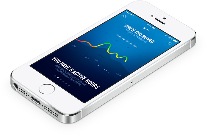
Like the FuelBand, the app keeps track of your daily lifestyle and activities to help you stay fit (though, it does not keep track of sleep patterns). Essentially, the Move app turns your iPhone into a FuelBand--for no additional monetary cost, at the expensive of requiring individuals to keep their smartphone on them. Surprisingly, the Move and FuelBand applications are completely separate. There seems to be no interaction between the two, other than keeping your FuelPoints in sync with your Nike account.
This is another case in which Nike could have innovated, but missed out-- accelerometer, motion, and location data could be cross referenced between the Move app and FuelBand hardware for more accurate tracking, or more simply, Nike could have integrated the Move functionality into the FuelBand app for convenience.
For the hard-core fitness buffs and individuals dedicated to quantifying their every movement, the FuelBand would be a fantastic sensor to have on your person. But for most people with an iPhone 5S, the Move app is more than enough. After all, most people have their phones on their person for the majority of the day. One potential gain with the FuelBand hardware is the ability to leave your bulky phone at home when on a run, but when faced with a decision to purchase a $150 fitness tracker or a $10 arm band, many people are going to choose to save the cash.
Going Forward
Nike needs to step it up over the next several months with software updates, or through the next year with a new hardware. They needs a killer feature to differentiate themselves from the increasing competition-- hey may have the brand power, but it's not difficult to fade into the background and fall behind others like FitBit and Withings. Symbian, Windows Mobile, and Blackberry have all faded into obscurity in the past ten years with Android and iOS skyrocketing, and the same could happen to Nike in the activity monitor and wearable technology space if they don't pick up the pace and surprise everyone with innovation.
Today, Apple unveiled the newest version of iOS 7. While the fact that the design was changed radically is not surprising, the actual changes themselves are…confusing.
With Windows (Phone), Xbox, Google, and various other companies taking a "flatter" approach to UI design, it only makes sense that Apple would want to follow the trend of simplicity-- especially now that Scott Forstall, the guy known for the skeuomorphic design elements present in previous versions of iOS. After all, that is what Apple strives for (especially in their hardware).
iOS 7 directly reflects the transition from Forstall to Ive's rule over iOS, but are the changes truly an improvement?
Note, the following statements are my own opinions. Everyone has a different preference for styles, and I am not suggesting any style is inherently better than another.
The home screen of the iPhone is critical-- it houses the icons for all of the user's apps, and without it, the iPhone would be useless.
Immediately, you'll notice the "flat" design for each of the icons. However, Apple's decided to keep a sense of depth throughout the entire operating system with the parallax effect and their distinctive "layers".
But, take a look at the various icons-- some of them have gradients (Mail, Safari, Music, Phone, etc), while others do not (Clock, Reminders, Game Center). Those icons with gradients also are largely inconsistent, with the "light source" seemingly to randomly come from above or below the icon (e.g. half the gradients are light-to-dark, while the others are dark-to-light).
And, what's up with the Game Center bubbles? I thought Apple was trying to get rid of the glossy elements.
Then, there's spacing problems. A lot of the UI elements seem cramped and smashed together in a padding-less mess.

Control Center, pictured above, seems to cram every single possible control into a sheet that slides up from the bottom of your screen. Here's a thought-- reduce the clutter and move things onto multiple pages, or remove useless buttons like the calculator and timer buttons. Or, how about making it user customizable?!
Even worse is the messages app--
There's a little bit too much public display of affection between the message bubbles. Give them some space and room to breathe.
It's clear where Apple is trying to go, but their design is slightly confused in that there are various inconsistencies in various elements, like gradients. Even more, there's some places where the skeuomorphic design hasn't been completely eradicated (e.g. Game Center).
Despite these design problems, the interface is still usable. A "wrong" gradient won't hurt anybody. But, there are some serious UX issues that need to be fixed as well.
Take a look at the new lock screen:
From the lock screen, you can pull the Notification Center down, Control Center up, or unlock the device by… Wait a minute-- which direction do you swipe to unlock the device? The arrow closest to the "Slide to Unlock" text points up, but that's for the Control Center.
Previous version of iOS had an arrow embedded into a "track", which made it extremely clear how to unlock the device. Here, there's really no clear action.
The same comment applies for the "slide to answer a phone call" bar, and presumably any other slider ("slide to power off").
The camera button in iOS 7 on the lock screen also seems to be hiding in the corner (again, with little space between the border of the phone and the icon). At least the screen bounces when you tap the icon, indicating what action you must perform to unlock-to-the-camera.
Apple still has some time to figure out iOS 7 and its direction, but because the change is so radical and risky, they better get it right or suffer from serious backlash.
Previously, we went over how the new WebP image format compared to the traditional JPG. One neat thing about WebP is that, unlike JPG or PNG, WebP has the ability to use either lossy or lossless compression, with or without transparency. While JPG is traditionally used to display photos, which have a high level of detail and are generally more complex and can suffer from a little bit of detail loss as a tradeoff for compression, WebP can also be used like a PNG, which is often used for web graphics with transparency or subtle patterns.
Like the previous test, we'll use a baseline image in a "traditional" format to compare the WebP file with. Because WebP is capable of storing alpha transparency (a key feature of PNG and one of the primary reasons to use the format) in a lossy image, we'll use a couple of images-- the baseline PNG, a losslessly compressed WebP image, a lossy (with alpha) image at a quality of 100, and a lossy image (with alpha) at a quality of 80. All of the previously listed formats are capable of alpha transparency. In these tests, the alpha_q quality was set to the default of 100.
Once again, we'll use Google's precompiled WebP encoder cwebp version 0.3.0, which is available for a variety of platforms on the official WebP download page. The command to output a lossless image from a source PNG file is cwebp -lossless [input] -o [output]. As with the JPG vs. WebP comparison, the command used to generate a lossy WebP file is cwebp -q [quality] [input] -o [output].
Book Cover Illustration
If you've seen my new home page design, you might have noticed the graphic of a book cover for "Learning Jekyll By Example." This graphic has relatively low complexity compared to a photograph, and also has transparency. Due to these two factors, I chose to use PNG as the image format to embed the graphic in my website. Now, let's see how WebP compares to PNG.
The original PNG image is 30.2 KB, versus the lossless WebP at 8.9 KB. You can download either of the source images with the links below, though they will look the same due to the lossless compression. You will need a WebP compatible image viewer, such as Google Chrome or Opera, to view the WebP file.
On the other hand, the lossy versions of the book cover have some quality loss depending on the quality setting used. Below I've included a screenshot of the book cover image at different quality settings for those that do not have a WebP capable browser, though you can also download the source files for your own comparison.
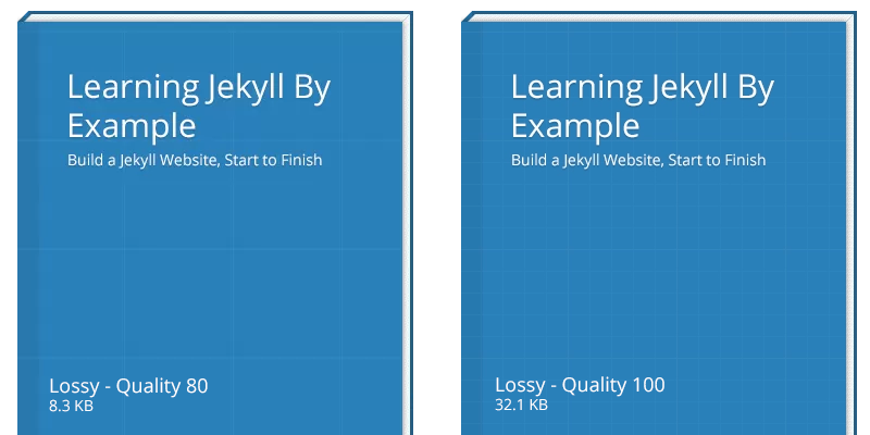
Note, you can click on any of the images in this post to view them full size and view them without your browser resizing the images.
As you can see, the lossy compressed WebP file has some noticeable detail loss. The biggest issue you can see is with the grid lines on the book cover, which have disappeared in some areas due to the compression. This also occurs at a quality setting of 90 (note: not shown). However, the lossy image at quality 100 looks fine with little to no quality loss compared to the lossless versions.
It should be noted that, with this image, the lossless image is actually smaller than the lossy image at quality 100, and comparable in file size to the lossy image at quality 80, though with no detail loss. With this image, it's clear that the lossless WebP encoder wins.
- Book cover - Baseline PNG (30.2 KB)
- Book cover - Lossless WebP (8.9 KB)
- Book cover - Lossy WebP, quality 100 (32.1 KB)
- Book cover - Lossy WebP, quality 80 (8.3 KB)
Ticket Graphic
Next, we'll test a ticket graphic by Premium Pixels. While the image does not have any transparency, the subtle pattern detail in the background and ticket graphics make it a prime candidate for PNG. JPG, or any other lossy format, will potentially reduce or eliminate this texture at higher compression settings.
The original PSD source file was saved as a PNG to serve as a baseline. The baseline PNG has the Photoshop setting "smallest/slow" enabled for compression, and no interlacing.

The original PNG comes in at a hefty 243 KB-- not ideal for mobile connections or visitors with lower bandwidth connections. In contrast, the lossless WebP image file is 183 KB in size. While it's a little bit smaller, we can still do better in terms of compression as the file is a little large.
The lossy images compared below come in at a smaller size than the lossless equivalent, unlike the previous test with the book cover graphic in which the lossless graphic was actually smaller than any of the lossy files. For comparison, you can see the differences between a quality setting of 100 and 80 below.

As you can see, the lossy compression resulted in artifacts at a quality of 80. In fact, if you compare the baseline (or even the lossy-100 WebP) file to the quality-80 WebP, you will notice significant reduction in texture detail-- especially in the background, which has effectively become a blocky radial gradient. The tickets themselves also show a reduction in texture in the lossy compressed WebP with a quality of 80. However, the lossy compressed WebP file at a quality of 80 has a file size that is a mere 2.6% of the original baseline PNG image-- impressive for the amount of detail retained in the compressed file.
- Tickets - Baseline PNG (243 KB)
- Tickets - Lossless WebP (183 KB)
- Tickets - Lossy WebP, quality 100 (94.5 KB)
- Tickets - Lossy WebP, quality 80 (6.4 KB)
As a bonus, let's take a look at how JPG fares in this test--

Coming in at 8.3 KB, the above JPG at quality 3 looks downright terrible compared to the WebP at a quality of 80 (and a file size of 6.5 KB). In addition, these file sizes were only achieved after being run through ImageOptim.
If you want to learn more about (the fantastic, and free) ImageOptim or other image optimization tools, why not check out my upcoming web course Extreme Website Performance"?
The WebP, even though it is smaller in file size than the JPG, has significantly more detail around the edges of the ticket and the gradient in the background is much smoother. While neither the WebP quality-80 or JPG quality-3 images are high enough detail to view the subtle textures in the image, WebP clearly wins for quality and file size against JPG in this test.
Other files, for comparison, are included below:
- Tickets - Lossy JPG, quality 3 (8.3 KB)
- Tickets - Lossy JPG, quality 1 (5.3 KB)
- Tickets - Lossy JPG, quality 0 (4.9 KB)
Conclusion
Depending on the image, it may or may not be beneficial to use the lossy WebP format. Images that require transparency may need to experiment with different lossy quality settings, or even the quality of the alpha channel (by default, in all of the images above, the alpha quality was 100). However, in the ticket example, it's clear that the lossy WebP compression can reduce the file size of web graphics significantly without any discernible detail loss.
There are several kinds of file formats for images on the web. Primarily, web developers use JPG and PNG image files, depending on the content of the image itself. However, Google has made a push recently to use a new format-- called WebP-- that is supposedly more efficient than JPG, yet still has the ability to have transparency. In other words, WebP is the best of both JPG and PNG file formats-- but does it really reduce image file sizes?
JPG vs. WebP
To compare the two file formats, we'll be using a baseline image taken by NASA's Marshall Space Flight Center of the Earth. The original file is 4288x2848 and in the JPG file format. For each of the following benchmarks, the image was saved in Photoshop as a JPG with variable quality settings. No further modifications have been made to the JPG files, and they have not been optimized further with any external tools. The WebP files were converted from the original JPG using the cwebp tool (version 0.3.0) on Mac OS X 10.8.
Note that due to resaving the file as a JPG in Photoshop, there is a "double penalty" for quality-- quality is reduced once when the photo was originally taken and compressed to JPG, and a second time when resaving the file with a different quality setting or when converted to WebP.
Finally, the comparison images posted within the blog post are shown as a losslessly compressed PNG to aid those users without a WebP capable browser. Additionally, depending on which browser you're using now, my server may automatically show you a WebP version of the inlined images, though this will also be a lossless image. To view the original JPG and WebP files, you can click on the links provided. You will need to drag the files into a WebP capable browser or image viewer, such as Google Chrome, to see the WebP images.
Baseline
The baseline image is that of the Earth taken from the International Space Station. You can view the original image (1.1 MB JPG) here, or see a resized version below to get a sense of what the image is of.

On a side note, if you're curious why the above preview image is 1440x956 and extremely low quality (yet, it doesn't look that way when you're looking at it in the post, only when viewed full size), it's a technique to make the image sharp for retina devices and still have a reasonably sized photo megabyte-wise. Why not take a look at my new web course on website performance for more infomation on how and why?
JPG at Varying Quality Levels - Full Size JPG
As you may know, JPG is a lossy image format. Essentially, this means to achieve smaller file sizes, image editing apps will compromise by adding artifacts. These varying quality levels result in more or less artifacting, which can be seen below. The preview image below has been cropped for a 1:1 pixel ratio on a normal, non-Retina screen. You can also click the image to open it in a new tab to ensure your browser is not scaling it.
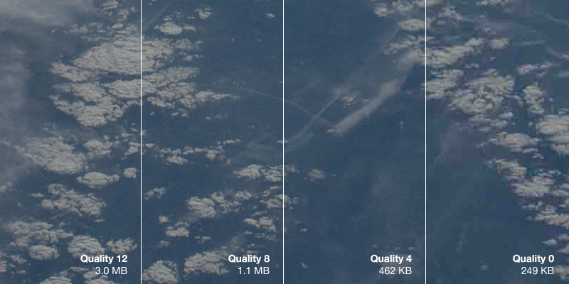
- Full Size JPG at Quality 12
- Full Size JPG at Quality 8
- Full Size JPG at Quality 4
- Full Size JPG at Quality 0
As you can see, the JPG with a quality setting of 0 is muddy and there are visible blocks of artifacts in the image. There is a significant loss of detail in the clouds to the point where they become hard to identify.
Remember-- the file sizes illustrated above are extremely large for the quality setting because the image is 4288x2848 pixels. Smaller graphics and photos, such as those you may embed in your website, will also be smaller in file size. However, the image file size savings still apply.
WebP at Varying Quality Levels
Now, we'll run the original, full size image through the WebP converter. We will also use the command, cwebp -q X original.jpg -o quality-X.webp, replacing the "X" with a quality level between 0 and 100.
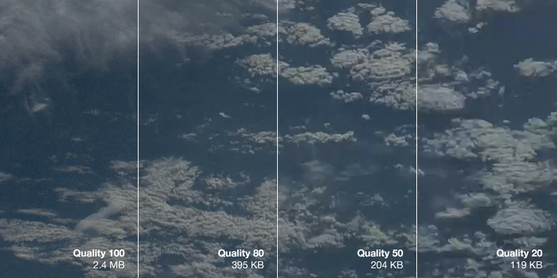
The first thing you'll notice is that the WebP images are significantly smaller than the JPG images-- at any comparable quality level. When comparing the images visually (e.g. you can argue that JPG quality 4 looks most similar to WebP quality 50), you can see that the WebP image can be approximately half the size at the same level of visual fidelity.
WebP is an exciting new tool for web developers. While not supported in the majority of browsers, WebP images can have similar quality to JPG photos at a much reduced file size. This is not only important because it reduces the loading time of your web page, but mobile and bandwidth capped users will not be forced to download extremely large images when visiting your web page. By using a server side optimization tool, such as mod_pagespeed, you can serve WebP images to your visitors capable of viewing them, and delivering older formats (such as JPG and PNG) to other browsers.
Next time, we'll look at losslessly compressed WebP images to see how the file sizes compare to PNG images.
Since I originally moved my blog to the Jekyll platform, I've been looking for several ways to push the performance of my website further.
Over the last couple of months, I've been exploring several content distribution networks for my new web course Extreme Website Performance, such as CloudFlare and Amazon's CloudFront, as well as forgoing a CDN altogether and focusing on reducing the number of network requests used (and therefore taking the bottleneck away from the distribution servers).
Currently, if you take a look at the source code of my website, you'll see something peculiar-- a severe lack of indentation and several, inlined Base 64 and WebP images. For example, here's a snippet of my website's source HTML from the home page.
<div class="photo">
<img src="data:image/webp;base64,UklGRg...AAA="/>
<h2><a href="/blog/multiple-gradients-css">Multiple Gradients in CSS</a></h2>
<span>20 May 2013</span>
</div>
Obviously, it would be counter productive for me to design my HTML pages without any indentation-- it would be a nightmare to manage opening and closing brackets. Rather, I've enabled mod_pagespeed by Google on my server, which does this minification for me automatically.
Essentially, mod_pagespeed is an Apache module by Google (also available in an nginx flavor under the name ngx_pagspeed) that optimizes your web pages, text assets, and images. It'll combine and minify your Javascript and CSS as well as recompress your images-- without your intervention and without adding a new build step in your deployment system. It can be considered a JIT compilation layer for your website.
Installing mod_pagespeed
Installing mod_pagspeed with the default parameters takes a little less than a minute. You can view the instructions to install the optimization system for your respective application server on the Google website. As mentioned previously, mod_pagespeed is available for the Apache and nginx servers.
Configuration
Out of the box, mod_pagespeed is ready to go and is immediately enabled for all of your HTTP websites, but a little bit of configuration you can do. You can find all of the configuration options and filters in the documentation.
If you'd like to disable mod_pagespeed globally and only enable it per-virtual-host, you can do so by editing the pagespeed.conf file. The location of this file depends on your server and operating system (the combinations of OS/Server and respective file locations are available in the documentation), but for Ubuntu and Debian servers with Apache, the file will usually be located in /etc/apache2/mods-available/.
In the pagespeed.conf file, you can specify global filters or enable/disable the optimization system entirely. To disable mod_pagespeed, simply add a new line in the configuration file:
ModPagespeed off
This single line will disable mod_pagespeed globally, but still allow you to enable it per-site.
To do so, edit your website's virtual host configuration (located in /etc/apache2/sites-available for Apache/Ubuntu/Debian users) and add a new line, similar to what you did previously to globally disable mod_pagespeed--
ModPagespeed on
Other options include the ModPagespeedEnableFilters configuration line item, which allows you to enable additional optimization filters, such as the GIF/PNG to WebP image converter.
My Configuration
Personally, I have three other filters enabled in addition to the defaults--
convert_jpeg_to_webpcollapse_whitespaceconvert_to_webp_lossless
The first and last filters in the list above automatically convert JPG, GIF, and PNG images to WebP when applicable and a supported browser is being used by the visitor. If you're using a supported browser, such as Google Chrome, you can see this for yourself by right clicking any image and viewing the source of the web page or copying the URL of the image.
The collapse_whitespace filter, while slightly more "dangerous" due to the fact that it significantly modifies the webpage itself with the potential to improperly remove whitespace, also reduces the file size of the HTML slightly.
Recently, a Redditor asked whether it was possible to create a background that looked like this UI mockup by Mike from Creative Mints.
In fact, it's quite easy to do so using multiple background images in CSS. The following solution requires no images, though it does require a browser to support multiple background images and radial CSS gradients.
div.gradient{
  width: 100%;
  height: 100%;
background: #FFF;

background-image:

-webkit-radial-gradient(80% 10%, circle, #BF7667, transparent),

-webkit-radial-gradient(80% 50%, circle, #EFDDB7, transparent),

-webkit-radial-gradient(20% 80%, 40em 40em, #977351, transparent),

-webkit-radial-gradient(10% 10%, circle, #E1C3B9, transparent);

}
The above code does not include vendor prefixes for browsers other than WebKit, though it is trivial to do so.
Essentially, all we do is create several radial gradients that fade from each specified color to transparent. Together, they all blend together to form what looks like the result of using a gaussian blur on a photograph.
I've had an iPhone for about a year and a half now, after previously owning a Windows Phone and Palm Pre. Each time I switch platforms, there's something I miss from my previous experiences, and something I long for in a platform I haven't tried yet. For me, Google Now for Android was this feature that I so desperately wanted to try.
A couple of weeks ago, Google released an update for the Google Search app on the iPhone, with Google Now as the headline feature. A while back, it was rumored that Google would be releasing this update with Now baked in, though this rumor was shot down by Apple, and Google later admitted that Eric Schmidt's comments were not necessarily accurate (or, rather, not interpreted correctly).
Recently, Google Now was also featured at Google's I/O conference. In addition to new cards, such as location aware reminders and public transit information, Google revealed several new services designed with a similar goal to Now-- to make your life easier, and to delve deeper into your personal information.
What is Google Now?
Google Now is an assistant that is able to learn from your habits and predict your future actions. If you believe this sounds creepy, you're not alone. Many individuals have serious concerns with Google's privacy practices in general, and Google Now is evidence that they are willing to leverage the masses of data available on each of its users.
However, privacy concerns aside, Google Now is quite impressive. On Now's home screen, you are presented with a list of cards, which each represent a different piece of information. The standard weather card, which changes based on your location, and sports scores are available, but the magic of Now is in its predictive capabilities.
If you allow it, Google Now will look through your email, calendar, search history, and location history to give you information about traffic on the drive to work or updates on the package you ordered from Amazon. Your location and search history are key to Now's full experience, because it allows Google to track everywhere you've been and everywhere you're going. Though many are afraid of a company, who's primary source of revenue is advertising, knowing all of this information, Now is able to use your history to your advantage and present information that will be useful to you. This is why Google Now is important-- primarily, it doesn't present information you've asked for, but information you will need for in the future-- without actually asking for it.
Interestingly, all of this is only possible because Google was behind it. Any startup could have come up with a similar concept, but the product would lack the integration that Now has. Because Google likely manages quite a bit of your life, whether it's your email, calendar, bus route, or school papers, they can extract information from each of these individual services to piece together a picture of your life you didn't even know existed.
The Omnipresent Assistant
Imagine a traditional office assistant that knows your work and travel schedule, manages your calendar, and occasionally arranges business related dinners and activities. But this is where it ends-- your office assistant has no access to your personal life or your weekend plans, for the most part. Google has, in some ways, built a perfect assistant. It completes your sentences, listens to your voice, and presents you with information related to your current and future locations. Not only does it do all of this, but it does it all the time.
Half of the people that use Now, including myself, gawk at this concept. What was formally a perk of a high-power position in a notable company is now available on your phone. While it doesn't actually make restaurant reservations for you, it is only a matter of time before Google integrates with Open Table or provides its own competitor in the space.
Now for Android already provides half of this experience-- your Fandango tickets and airline boarding passes are automatically displayed for scanning. Combine this with Siri's ability to purchase movie tickets (yes, it does open the Fandango app, though this is not a bad thing-- purchases should always require explicit human intervention), and you suddenly can manage the majority of your social life from an app.
The other side of the fence is critical of Now's always-on design. It tracks your location and search history, and in the case of Android phones, how many steps you take and miles biked. All of this data can be used to build a profile on every internet connected individual on an unprecedented scale. Theoretically, Google, among other social networks and applications, knows what you like to eat, what your favorite movie theatre is, and other facts about yourself. I would bet, from the data set that represents you as an individual, Google could determine your favorite color and animal, any various other tidbits of information that you'd probably only extract from another human being after a decently in-depth conversation.
If Google knows all of this, what is to stop them from using the information to sell you more of your favorite pink socks or recommend specific medication for an illness you've contracted? Where does the company's bounds end? Personally, I might be embarrassed if Google Now tried to inform me that a particular medication was available at a store nearby, despite their benevolent intentions. I believe some information is best kept from the public eye and best left to doctors, therapists, significant others, or those blood related to me. Yet, with all the information we feed through Google's inlets, intentionally or otherwise, Google already knows all of this private information.
Talking to Your Computer
While Voice has been built into Google's search application for Android, iOS, and Chrome and has been a part of Google Now, they have also made a push to make voice search easier on the desktop. With a simple "hot-word" phrase, "Ok, Google", you can trigger voice search without touching your keyboard. While this is a neat feature, it also highlights another privacy concern-- your web browser is always "listening" to what you say and is waiting to "hear" the key phrase.
The technology does not truly record all of your conversations (or even listen to them in the "traditional" sense of understanding every word you say), but the idea behind your computer listening to you all the time is unsettling to some. If you sing along to your music or talk to yourself while you're alone in your home or office, the hot-word triggered voice search may mean you aren't truly alone-- your computer is there with you, and listening.
Search is Now Personal
Another feature demoed by Google at I/O is the ability to search through your personal photos and calendar from the Google website. A query, such as "my photos from my trip to Las Vegas last year," will pull up your Google+ album containing the photos you requested. Additionally, similar searches for "my airline reservation" or "my restaurant reservation" will pull up the appropriate personalized results.
This conversational search feature is related to Now in an important way-- it's another input for Now to gather data from. All of this personal information is being pulled together by Google to form the future of technology-- a personalized, searchable, predictive "knowledge graph" that is tailored to each individual person. All of Google's products, including Gmail, Search, Calendar, and even Android, are sensory inputs for what is the Google "brain"--the knowledge graph--that contains information on nearly every person, business, landmark, and entity in the known universe. Google Now, as well as the new voice search products, are simply ways for us to access this brain.
Now is the Future
Whether you like it or not, you can keep no secrets from Google. Your past, no matter how dark, is reflected in your search history. While Google does anonymize search data after a period of time, it was associated with you-- an individual-- for some time. And if you consent, your location history may reveal which "adult" stores are your favorites to visit-- even if you forgot that you ever enabled the location history in the first place. Storage is cheap, so keeping all of this data around is trivial for a company as large as Google. And in the future, it'll only become easier.
But if you can live in ignorance, or minimally trust Google with your data, Google Now is representative of the future of technology-- an organic, learning piece of software that helps you get through the day. If I can save myself the headache of being late to work or a meeting due traffic, Now is worth the tradeoff.
Some people may even find it odd that I want to provide even more data to Google through avenues such as the Play Store All Access Music subscription so that I can get personalized recommendations for music in Now, but I am constantly fascinated at Google's ability to turn up so much information on me that even I didn't know.
I may be selling myself and habits to a company dedicated to advertising, but nothing comes free.
Do you enjoy my writing?
Follow me on Twitter to find out when I write new articles. You can also add me to your circles on Google+. I promise, I won't tweet about what I had for dinner!
As long as I can remember, I have used some form of MAMP/WAMP stack for development. I'd download the entire stack pre-packaged with some sort of control console, and develop web applications straight out of my Dropbox folder (with Git as version control), changing the web root of the *AMP configuration depending on which project I am working on.
This worked fine for many years, but recently I've discovered the magic of Vagrant and Puppet.
What's Wrong with XAMPP/MAMP?
The primary reason XAMPP and MAMP are wrong tools to use for development is due to the software stack's differences from your production environment. While they likely aren't far off, it's these subtle differences that will catch you off guard and make your web application fail in testing or staging environments. Worse yet, if you don't have a proper testing or staging environment configured, you may only run into these bugs once you've deployed your website or application into production.
Even developers that run a LAMP stack on a Linux development machine will encounter problems due to the idiosyncrasies of different Linux distributions, compiled server binaries, and installed dependencies. More often than not you'll forget you had to manually install an extra package at some point in the past, and will be caught off guard when your app throws and exception with a missing dependency error in production.
How Does Vagrant Help?
Vagrant is a solution to this problem. Essentially, Vagrant is a wrapper around the VirtualBox virtualization platform that manages headless server instances for you.
With a single command, vagrant up, I have Vagrant setup to launch an Ubuntu 12.10 x64 Server instance and install a common LAMP stack through Puppet, with various dependencies and extra packages such as Git. All of this is done in about five minutes, without my intervention. Once the setup is complete, I point my web browser to localhost:8080 and can immediately see my web application running.
The automation is nice to prevent tedious recreation of the environment for every new development machine, but it also means that I get the same environment no matter what operating system I choose for development. On my Windows desktop workstation and my Macbook Air, Vagrant creates the exact same virtual machine, complete with the same amount of RAM, and LAMP stack running on the same version of Ubuntu.
As a bonus, there are several plugins that allow you to spin up servers at remote providers, such as AWS or Digital Ocean. This even removes the discrepancies between VirtualBox's emulation and the virtualization platform your production hosting provider uses.
What is Puppet?
While Vagrant manages the virtual machine and allows me to spin up and destroy the instance at will, Puppet is the tool that performs the magic of installing Apache, MySQL, PHP, and other packages such as Git. Normally, I'd have a long checklist of packages that I needed to ensure were installed in the virtual machine, but Puppet manages these automatically.
Essentially, I have a configuration file that says "ensure the following packages are created and directories are writable, and if they aren't, make them that way". Puppet follows these instructions and only performs the necessary actions. You can run the Puppet manifest on an already booted machine or a completely new instance, and end up with all of the required packages either way.
Why Take the Time to Set These Tools Up?
Before Vagrant and Puppet, I managed a production server and my development environment separately. It worked 99% of the time, but the 1% it doesn't becomes a large hassle. When I started running into issues with differences between environments, such as missing php5-mcrypt or having incorrect permissions on a specific folder, it can take precious time to find and fix these bugs.
In particular, while upgrading a PHP package for my welcome bar service ThreeBar, I ran into a peculiar issue that boiled down to missing dependencies, which I had installed on my Macbook Air through MAMP but not the Ubuntu server that is used in production. After several hours debugging the application on my test server, I was able to find a solution-- but at the cost of wasted time.
I'm sure, you, as a developer, have also encountered these same issues, of which Vagrant and Puppet are solutions to. Though they both take some configuration to setup initially, once done, you won't have to think about setting up another server by hand again.
Basic Flow
To give you an insight to my development process for ThreeBar, here's an example of how I take a newly formatted development workstation to a fully setup development machine:
- Install GitHub for Windows, or the command line Git for Mac/Linux (this depends on the workstation's OS)
- Install VirtualBox and Vagrant
- Clone the Git repository for ThreeBar
- Run
vagrant up webto launch a new virtual machine. This downloads a Ubuntu 12.10 x64 Server image, launches it, and installs the Puppet manifest - Wait until setup is complete
- Run
vagrant ssh webto launch a SSH session into the VM - Run
cd /var/www; php composer.phar install; php artisan optimizeto install the Composer dependencies and run Laravel's bootstrap file generation tool.
To ensure none of these steps are missed, the Git repository has a Readme file with all of the above steps.
After these steps are done, I can point my web browser to localhost:8080 to see a development version of ThreeBar running. The last couple of steps can be automated, but I haven't done so yet because they only need to be run once when the Git repository is initially cloned.
How to Get Started
If you are looking to get started with Vagrant or Puppet, take a look at some of the following resources. The examples, in particular, and great to understand how to use the two applications.
I heavily based my initial configuration off of some of these examples, though they have been modified to install additional dependencies needed by my application.
Almost a year ago, a new and innovative project was published on Kickstarter. Expecting to make only a couple thousand watches at most, Pebble was completely unaware of the impact their product would make in the coming months.
Ten million dollars later, the Pebble smart watch shattered Kickstarter's record for the most money funded for a project and had the task of coordinating the design and manufacturing of over 80,000 watches to some 65,000 Kickstarter backers around the world. Despite selling out of the watch on the crowd funding website, Pebble's success was reinforced when they continued to sell pre-orders on their website.
At the beginning of January 2013 at CES, Pebble announced they would begin shipping watches to their backers. The end to the long road of fulfilling Kickstarter rewards was in sight. Due to the sheer volume of watches that needed to be produced, Kickstarter backers are still receiving their pledge rewards as of today. In fact, to my knowledge, only the black watches have been shipped so far due to the overwhelming demand of that particular color-- there are still three other colors of watches waiting to be produced.
I received my Pebble watch today-- something known as "Pebble Time", or #PebbleTime on Twitter, by Kickstarter backers-- and immediately put the watch through its paces. I've been told the packaging is similar to that of the Amazon Kindle-- a basic cardboard box with some branding, and a removable "zipper" that causes it to open. Once the zipper is opened, the box cannot be resealed.
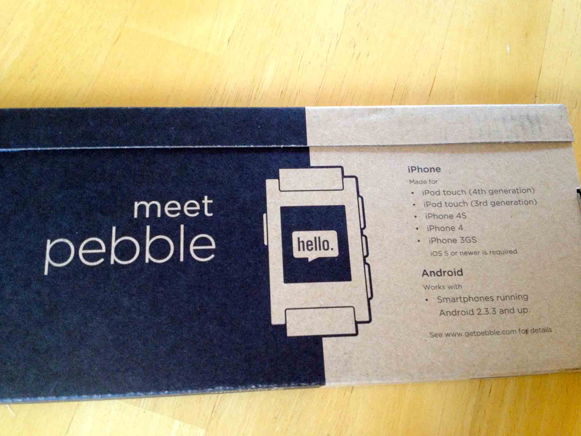
Inside the box, there are really only two pieces of hardware-- the watch itself, and the magnetic charging cord.
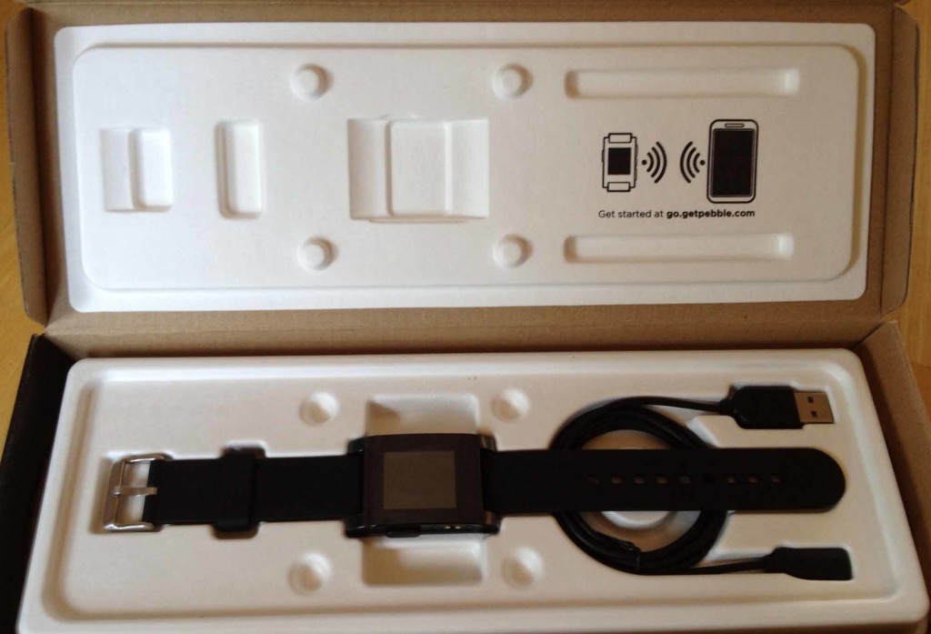
The Hardware
Upon turning the watch on, it's obvious how good the display is. In the sunlight, the bistable LCD display looks amazing. It is worth noting that the LCD on the Pebble is not E-Ink (which is a specific, proprietary type of E-Paper used in the Amazon Kindle). Rather, it is a black and white zero-power LCD that behaves similarly to E-Ink, but without the annoying "flash" when the screen refreshes. In fact, the LCD used on the Pebble is capable of full animations, which the software makes gratuitous use of.
It's quite impressive to see the LCD while animating in the sunlight: the contrast is fantastic and it looks surreal in motion. The resolution of the screen is 144x168. In a day and age where every new mobile phone screen is of "retina" quality, the pixels are certainly noticeable, though not distracting. Because the screen is black and white and has no intermediate shades of gray, you'll see a dithering effect in some areas of the UI that are used to simulate varying levels of opacity. It's reminiscent of the Apple Newton days, and the UI makes fantastic use of the screen’s capabilities (or lack thereof, depending on how you think of it).
The backlight is relatively bright-- but not overwhelmingly so--and is perfect for when you're in dark. The ambient light sensor should theoretically prevent the backlight from activating needlessly and draining your battery.
Another area of importance is the physical buttons on the side of the device. There are four in total-- three on the right, one on the left. They provide a bit of resistance, but there's a small "click" of feedback that can be felt. I wouldn't be worried about them wearing out or being accidentally pressed when your hands are in your pockets or moving around.
Also on the left side of the watch is the magnetic charging contacts. Like the Macbook Air and Macbook Pro laptops from Apple, there is a magnet inside of the charging cable head that snaps the cord into place on the watch with a satisfying “click”. The magnet isn't very strong and won't even hold its own weight when hanging off the watch, but it works fine for guiding the cable into the correct place. Overall, this is a great feature of Pebble as it allows the watch to be waterproof up to 5 ATM.
The battery is stated to last up to a week, and while many backers are complaining of short battery lives, Pebble has stated they are working on it.
Around the back of the watch are the words "Kickstarter Edition" along with an engraved "pebble" logo. You'll also find your serial number and the requisite FCC markings, along with an indicator of 5 ATM of water resistance.
The black watch strap itself is nothing to write home about. It's pretty standard looking with a silver metal clasp, but the band itself is relatively stiff compared to other watches I've worn, making it slightly more difficult to take the watch off. The good news is, the strap is replacable.
The body of the Pebble is made of plastic and is extremely light compared to more traditional watches made of metal. There's no rattling of loose parts or buttons when shaking the device, which is good because you'll find yourself shaking your wrist often to turn on the backlight. The plastic doesn't feel cheap, but it certainly is not something I'd be comfortable banging on a granite kitchen counter for fear of cracking the display lens or body.
Setting Pebble Up
The first thing you must do when you switch the watch on is pair it with an Android or iOS device (usually your smartphone). As far as I can tell, there is no way to use the Pebble without one. To begin, you are instructed to go into your Bluetooth settings and pair the watch with your phone. After it’s been paired, you will need to download the Pebble app from the Apple App Store or Google Play.
The Pebble app on the iPhone, while usable, is slightly confusing due to its use of ambiguous icons, menus, and gestures. Tapping the icon that looks like an EKG wave takes you to a screen with diagnostic information about your watch, such as its name (which is based on your serial number) and connection status. Tapping the name of the watch will result in your Pebble vibrating and indicating "Ping Received" on its display, which is useful for testing connectivity of your watch.
If an update is available, you'll also see it in this diagnostic screen. After pairing your watch, updating it to the latest edition of the operating system is critical. There's bug fixes and new features in more recent versions of the software, plus fixes for a rare issue where the Pebble would actually become bricked.
I had some issues updating the watch initially where my phone would indicate the update failed and needed to be retried. Eventually, the update went through and took a little over a minute to apply to the watch.
After the watch rebooted (which is a little bit odd to think about, considering watches are traditionally not thought about as computers), I proceeded to install new watch faces from the watch app store.
Inside the Pebble app on your phone, you'll find the watch face selection screen behind the wrench icon. Above the button titled "Select watch faces" is a list of the watch faces currently installed on your Pebble (it'll be empty when you first receive your watch). Tapping the green button opens a new menu with a list of available apps and watch faces, along with screenshots, their names, and the developers' names.
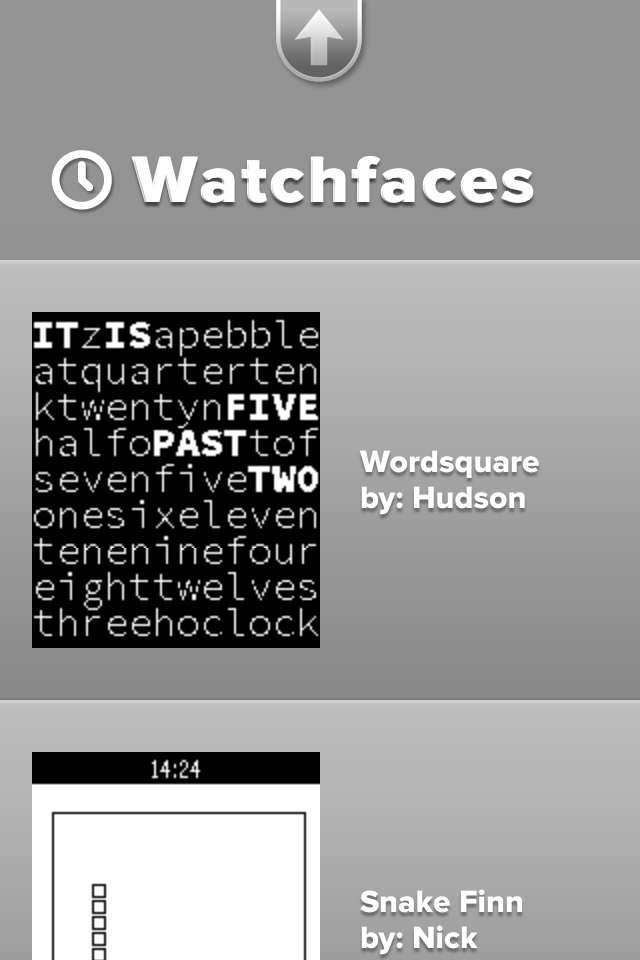
I installed 91 Dub, Simplicity, Brains, and Snake Finn initially. One cool feature about the Pebble is the ability to have multiple apps installed on the watch-- you don't have to ever pull out your phone to switch watch faces (except when adding new ones).
Using Pebble
The most recent major version of the Pebble operating system, version 1.9, changed the way you navigate through the UI. Previously, watch faces were listed in the main menu with other apps such as Music and Settings, however they are now considered to be the "bottom" of the navigation stack.
Essentially, this means if you keep hitting the back button (the button on the left hand side of the watch) you will eventually see the watch faces. The up and down buttons on the right then navigate through all of the watch faces installed on the device. Personally, I find this navigation more intuitive-- it's always easy to find your way back to a watch face without going through menus.
Hitting the middle button on the right hand side of the watch, which acts as a select or enter button, will take you to the main menu. Right now, the only options on the Pebble are to control your music, set an alarm, see all watch faces installed on your device, and go into the settings. The word "only" doesn't seem quite appropriate, because in reality, it is quite a few menu items for you to choose from considering the Pebble is a watch.
Watch Faces
There is a limited selection of watch faces in the watch App Store, though this will change after the SDK is released later in April. Currently, the available watch faces and apps are displayed in a single scrolling list within the Pebble app on your phone, which will become problematic once there are more watch faces to choose from.
Oddly, though the Settings app allows you to select 12 or 24 hour time formats, individual downloaded watch faces do not respect this setting. In fact, some watch faces have two individual versions in the watch face store-- one for each time format. Hopefully this will be resolved in a future software update and developers will be able to display one time format or the other based on a Pebble user’s settings without having two different apps.
Notifications
Notifications on the Pebble are dependent on your phone's operating system. In general, you can count on the following notifications showing up on your watch:
- Caller ID
- SMS and iMessage
- Calendar alerts
- Alarms
Android users have some additional notifications not present on iOS, though the same is true in reverse. Jailbroken iPhone users can install a tweak called "BTNotificationEnabler" to push all notifications to your watch, including Twitter, Facebook, Mailbox, Spotify, or any other app that works with notification center.
Once you receive a notification, you can easily dismiss it by pressing the back button. Alternatively, you can leave the Pebble alone for a few minutes and the notification will slide away by itself.
The vibrating motor that triggers when you receive a notification is relatively powerful and is easy to feel. It does make a little bit of a rumbling noise, but it won't be noticable in most situations. The one issue I have with the vibrating motor is at night-- if your Pebble is on your desk, you will probably hear it. The vibration isn't muffled like your typical iPhone or Android device-- it's pretty loud and cuts through the silence. Whether you wake up or not depends on if you are a light sleeper.
Backlight
The backlight can be activated in a couple of ways-- by flicking your wrist, or pressing a button. There is an ambient light sensor, and I'm guessing the device intelligently guesses whether to enable the backlight or not depending on your surroundings.
Flicking your wrist to enable the backlight is intutive and a conventient gesture to have. There seems to be onyl a few cases where the backlight "misfires" due to putting my hand down on a table, but otherwise it's pretty good at detecting when I actually want the backlight to turn on.
Final Thoughts
It's really difficult to call the Pebble a watch. Not only does it communicate with your smartphone, but it has an operating system of its own and can run standalone apps (Snake!). Pebble can be a fitness instrument, a navigation tool, and so much more. The SDK, which will be released later in April, will open the platform to developers worldwide and spark a new generation of apps-- those that are always on and visible at a glance of your watch.
The hardware is refined and feels great, despite being plastic, which important because it cannot be changed at a later date. While the software needs some improvement in areas, Pebble is slowly becoming better over time thanks to the software updates. This is the killer feature of Pebble-- your watch is never static because data and software can flow to and from it.
Pebble, in my opinion, has defined a new genre of wearable devices. It was only after the Pebble's success did other companies begin to express significant interest (at least, have rumored to be interested) in creating smartwatches.
As the year goes on, it will be interesting to see larger companies try and create an experience as refined as Pebble. Some will likely succeed or even surpass the Pebble, but others may take the path of the MotoActiv and fade into relative obscurity. Until then, the Pebble is a fantastic device to augment your phone, and a product every one of the Kickstarter backers should be looking forward to receiving.
Today, Facebook launched their new "Home" experience and the HTC First. Conceptually, the Android home screen replacement seems like a fantastic idea-- it places bright, large photos on your lock screen that can be swiped through when you have a free moment, and focuses on your friends.
But, there's a fundamental issue with placing user generated content on your home screen.
Your Facebook Home experience, like the website itself, is solely determined by your friends' activity.
But, unlike the website, you carry this experience around with you front and center.
Facebook portrays this experience as emotional, with your friends' best moments slowly panning by on your lock screen. Their marketing page is filled with "perfect" lives and people, sharing only beautiful, colorful pictures.
The problem is, a lot of my Facebook friends don't post pictures like that. Thanks to some of the trouble makers who don't have an internal sense of what content is appropriate for Facebook, my experience would have gone something like this:
My boss asks me a question about my schedule, I pull out my phone. He comments on one of the pictures scrolling by-- it's one of my friends with her dog. A second later, the photo changes-- it's a picture of the inside of a toilet bowl, after someone... *ahem* already "used" it, with the poster bragging about what he "gave birth to today."
Sorry, Facebook, but until my friends can figure out what's appropriate to put online (I'd give it until after college when they are all searching for jobs at companies that do Facebook profile checks), user posted content is staying off my lock screen where everyone can catch a glimpse of it.
Note: the photos I described are completely true (I hid the toilet one after scrolling by it briefly), but the scenario is fictional to illustrate what might have happened if this was on my lock screen at work
After a couple of long years using 1&1 Shared Hosting and Virtual Private Servers, I've completely migrated all of my hosting to Digital Ocean and Heroku, and my domains to Namecheap. And after trying to cancel my 1&1 account, I now have complete justification for doing so.
1&1's experience has always been similar to that of a larger company, with over complicated systems and procedures to do simple things. Contacting their support means waiting through a phone queue, domains sometimes can take forever to switch name servers (though the process in itself takes a while on any provider, 1&1 seems particularly slow), and the various FTP and database account management systems are nightmares.
On March 30th, I navigated to 1&1's dedicated cancelation website and began the longer-than-needed process to terminate my account. At the end, I was greeted with a screen that asked me to call their support to confirm the cancelation.
Being required to call phone support is not the issue. In fact, it's probably better practice to require some sort of confirmation to prevent malicious third parties from terminating your business's website, but there was one line that bugged me:
"Please have your customer ID and password ready"
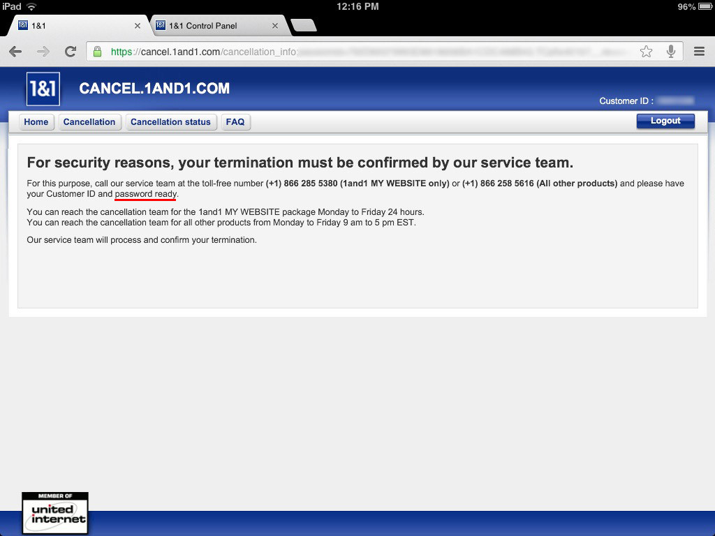
So, you want me to give my password to a phone support representative? Why not ask for my social security number, too?
There are plenty of other ways of confirming my identity and ability to access the account, such as the last four digits of the billing credit card or address and phone number tied to the account. In the end, after refusing to give the password, the representative was helpful and simply asked for the address and phone number, but it's the mere thought of a company asking for my password that is ridiculous.
While I use 1Password to generate unique passwords for each account I use, the majority of people that use 1&1 (non tech-savvy business owners using tools like 1&1's website builder) do not use unique passwords.
1&1-- asking someone for their password over the phone is extremely bad practice and this issue needs to be resolved immediately. It's as simple as changing the customer support's call script to ask for an address instead. With the many issues surrounding password security present in many websites, we don't need another point of weakness for security.