#wearable-technology
Many years ago, I received a Timex Internet Messenger watch. Back then, my parents used it to send me a message when it was time to come inside after a day of playing with my friends in the neighborhood (like I said, this was a long time ago). I loved the thing, and I'm not entirely sure why-- it was just a watch.
But my obsession with the Timex was an indicator of a budding obsession for the latest technology. At this point, I didn't have a cell phone or laptop, and I barely had my own desktop computer for the little homework I had. Yet I was still fascinated with the ability to receive a message on my wrist, and always be connected-- even it was just to my parents.
Fast forward around eight years, and it's the year 2013. We have desktop computers powerful enough to render 3D worlds, and computers almost as powerful in our pockets. The smartphone sitting on your desk or in your pocket didn't even exist eight years ago outside the mind of forward thinking individuals. As I sit here on my laptop, my watch chirps. Like the Timex that seemed as if it were from the future, which has long since been lost in my drawers, it dinged because someone had sent me a message.
The watch I'm currently wearing is the Cookoo, which was crowd funded on the Kickstarter platform this last Summer. I recently attended CES and had the priviledge of meeting with several individuals from companies funded by Kickstarter backers. By random chance, walking one of the several massive halls in the Las Vegas Convention Center, I ran into Peter Hauser-- the man behind Cookoo.
Stacked behind him was a literal mountain of watches-- products of the world we now live in. Eight years ago, a product like Cookoo that began in the mind of an individual, would probably not have existed-- at least not in the form we have today. Instead, it may have been a product of a large corporation, or it may have not existed at all. Thanks to Kickstarter, a futuristic idea, the ability to be always connected, was able to take shape in the physical world.
Cookoo
Like the Timex I used to wear, the Cookoo is designed to keep you connected with the outside world-- even when you do not have your phone in your hand. While the device doesn't connect to a pager or cell phone network to receive messages, it does connect to the device most individuals carry-- a smart phone. The Cookoo displays Facebook notifications, alarms, reminders, and missed call notifications. In addition, you can drop pins on a map, check in to locations on Facebook, take a photo remotely by pressing a button on the watch, and control music playback on your phone.
The Watch
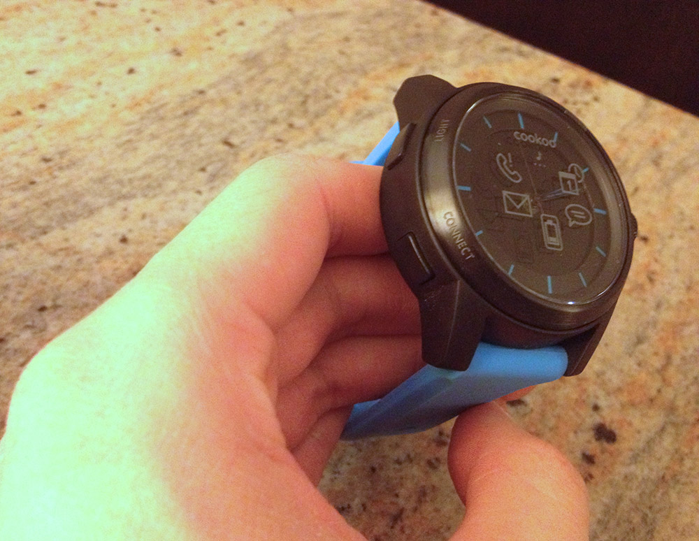
First and foremost, the Cookoo is a watch. This isn't the Pebble or Sony Smartwatch watch, and the Cookoo isn't remotely like any of the variations of digital smartwatches that have LCD or E-Ink screens. To a passerby, you're just wearing another analog watch. Depending on what type of person you are the Cookoo may be perfectly discreet.
Physically, the watch is large. It is certainly thicker than your normal watch, but it is smaller than some of the expensive mechanical dive watches you may find in a jewler or specialty watch store. While the purpose of a dive watch's thickness is to withstand the immense pressure of deep water, Cookoo's size is largely attributed to the fact it houses two removable batteries, Bluetooth electronics, and the time keeping piece itself.
However, despite its size, it isn't unbearable. I have extremely small wrists and often have issues with watch bands being too large, but the Cookoo, while it takes some getting used to, fits fine. Just for reference, I normally have the little stick that goes through the band in the fourth-smallest hole. The band itself isn't anything special, but it'll keep the Cookoo on your wrist without any problems.
The buttons--all four of them--are placed in the standard corners, and they feel solid and give decent tactile feedback. I'm not worried about them breaking or getting stuck. The button in the top left is for turning on the backlight, while the top right changes the watch from beep and vibrate to vibrate to just beeping to silent. The bottom left button is for pairing the watch to your phone, while the bottom right is the programmable "command" button. A short, medium, or long press of the command button performs a task you configure from the app on your phone.
The Watchface
Arguably, the watch face itself is the most important piece of the device. If you can't read the time on a watch, it's useless. The Cookoo has a standard, black watch face with no numerical markings. I have the black-and-blue watch, so the little notches indicating the hours and minutes are all blue. The Cookoo's face works fine for its purpose-- telling the time. It's simplistic, clean, and relatively easy to read in daylight.
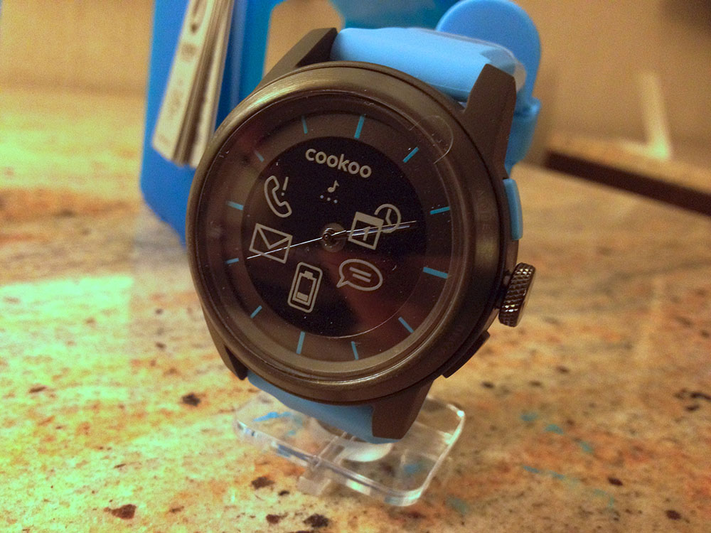
The hands themselves are your standard watch hands, with the hour and minute hands having blue highlights on them. The seconds hand is a standard, black stick.
My one gripe with the face of the watch is that the hands and hour markings do not light up or glow. This is a small issue in the dark, because while there's a blue backlight that allows me to see the silhouette of the hands, it can be difficult to distinguish between the hour and minute hands. It'd have been nice to be able to have the blue highlights glow, mainly so you can distinguish between hours and minutes a little bit faster when you're just glancing at your watch.
Other than the lack of glowing markings, the face is relatively nice looking. It's plain, and when the Bluetooth component of the watch is off, there's actually nothing on the face but the black background and blue watch hands.
When you receive a notification, an icon on the watch face will blink. The icon itself does not light up-- you still need to use the backlight to see it on the watch face in the dark, but this works great and the backlight makes it extremely easy to see the icons.
Bluetooth Connectivity
This is why you'd buy the Cookoo over any other analog watch-- it can connect to your phone over Bluetooth. It is worth noting that Cookoo only supports Bluetooth 4.0 because of its low power usage, so for now, only iOS devices are supported. There is a beta app for Android that seems to be coming soon, but support for devices is pretty minimal due to complications with Android's Bluetooth stack.
When I originally began using the watch, Bluetooth connectivity was relatively poor. The watch would drop the signal and not pick it back up at least once a day. The update to the iPhone app has seemed to mostly resolve the issue. I did have one occasion recently where the connection dropped, but after reopening the app the watch began to function correctly again and reconnected. When I walk out of range of my phone, the watch beeps once and disconnects, but has no problem reconnecting when I come back in range.
Because Bluetooth 4.0 doesn't have support for the MAP protocol, which is often used in car systems to send and receive text messages, and iOS doesn't expose SMS data, there is currently no way to have the watch vibrate when you receive a text. For heavy texters, this may be a deal breaker. However, Facebook notifications and calendar reminders work great, and the watch beeps as soon as you receieve either one of these.
The one issue with the Facebook notifications is the fact that they are lumped together and displayed using the message bubble icon on the watch. You'd expect that particular icon to show up for texts and Facebook messages, but pokes and Likes also will trigger the message bubble alert. Obviously, this isn't really solvable due to the limited number of icons that can light up, but Cookoo is about letting you know something happened-- not exactly what happened. I couldn't get the low battery notifications to work-- when my phone hits 20%, the phone will alert me, but the watch doesn't seem to do anything.
Bluetooth 4.0 uses very little power, so the watch is supposed to last up to a year of being connected to your phone. I can't really test this, but it is nice to not have to worry about charging. The mechanical watch movement and time keeping uses a separate battery and runs for up to three years.
Packaging
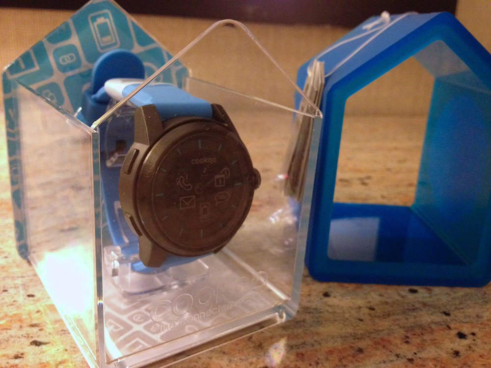
The packaging of Cookoo, in my opinion, is brilliant. It not only fits in well with the entire theme of the watch, but it can be recycled and used as a bird house. Considering the packaging is one of the first things you see when a product is sitting at a booth at CES or on a store shelf, it's extremely important to get right. Cookoo nailed it, in my opinion. Opening the packaging wasn't difficult and the housing itself is extremely sturdy. Call me selfish, but I haven't used it as a bird house because I actually want to keep the packaging for myself.
Always Connected
Cookoo hasn't changed my life, but it has changed my dependence on my phone-- a little bit. I've finally grown out of the habit of using my phone to check the time (there was a point where I had the Cookoo on and still used my phone), and the tiny chirps are discreet and aren't distracting to others. The one problem is, because Cookoo tells you something has happened, you may be slightly more tempted to check your phone to see what it is.
But because I can now tell the difference between a calendar reminder and a message, I can see the calendar icon blink and say, "oh yeah, it's 8'clock, so that must be my appointment alarm" instead of checking my phone to make sure it's not an important message. Normally I have my phone on silent, so I don't have the luxury of distinguishing between audio tones.
In the end, Cookoo is a device to augment your phone-- not replace it. The watch performs admirably at its task of telling the time, and for those that don't like the "all digital" look of other smart watches and yet want to be always connected, the Cookoo may be for you.
Just a note: all of the photos show the Cookoo watch with icons. To be clear, that is the sticker covering the watch face-- not the icons lit up on the device. The icons themselves are on the black background, not directly on the glass face.
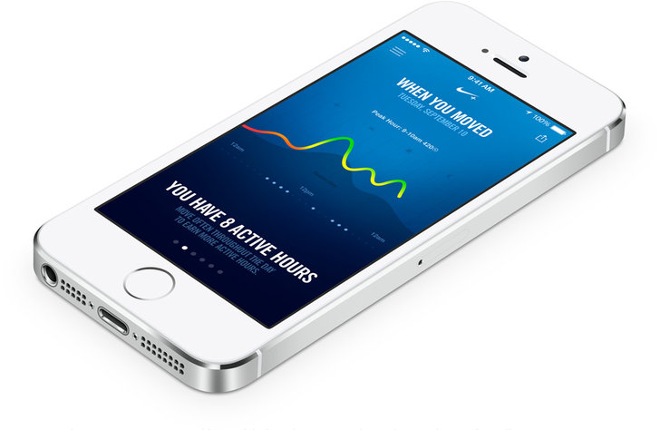
In February of 2012, Nike released the Nike+ FuelBand-- a sleek, discreet wristband that tracks your everyday activities and awards you "NikeFuel points", a proprietary metric designed to consolidate different types of activities into a universal standard. With competitors such as FitBit already gone through several iterations of high-tech wearable pedometers, Nike needed to develop a device that worked well, and looked good.
The original FuelBand received mixed reviews, with many users complaining about reliability over time. Despite the hardware issues, Nike's FuelBand was a solid entry into the "Quantified Self" movement that seems to be increasing in popularity.
Fast forward a year and a half, and the second generation Nike+ FuelBand SE device is nearly available for public consumption. But, with only small improvements in tracking and an update to the Bluetooth 4.0 standard, Nike has missed a valuable opportunity to differentiate themselves in the expanding field of wearable electronics, and instead spent over a year creating a minor iteration of its existing device.
Wearable Computers
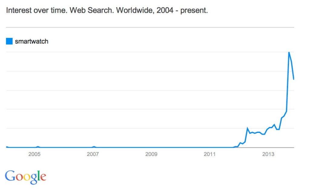
Wearable technology is becoming more popular, with terms such as "smartwatch" and "activity tracker" skyrocketing in popularity over the last two years.
![]()
Companies such as FitBit, Jawbone, Motorola, and others have been producing new generations of bands, clips, and watch-like devices to track fitness and activities. Even outside of activity trackers, smart-watches are becoming less of a sci-fi, geek toy and instead are now practical and affordable thanks to companies such as Pebble, Metawatch, and Samsung.
While the entries currently on the market are still relatively young and reflective of their first generation nature, the important fact is that the general public is becoming aware of their availability. Samsung's recent push in advertising the Galaxy Gear portrays the device as one straight out of a science fiction movie, and is a notable example of the initiative to increase mass market appeal of these wearable devices.
Yet, some people aren't ready to consider a smart watch a socially acceptable accessory with their sometimes bulky form factor. While a wrist band or activity tracker clip is discreet, a Pebble or Galaxy Gear watch will often stick out like a sore thumb. I personally have a Pebble, being a Kickstarter backer, and often get comments on my watch for its unique looks-- even if others are unaware of its full capabilities. Because it doesn't strictly look like a traditional, round watch, it's difficult to hide, and while my geeky personality is complimented by a device such as the Pebble, others aren't quite as ready to put one on.
Hiding in Plain Sight
This is an area where Nike nailed the execution of the FuelBand-- it's design is stunning. You, or any passer-by, will barely notice the FuelBand's simplistic form. When off, the band has no visible lights or screen and has a single button on its face. It's one, seemingly continuous black band of matte material, but when the screen lights up out of the blank face the FuelBand looks futuristic, though not in a tacky way. If you're more inclined to make the FuelBand's presence known, the original had several other color options to choose from, including a clear plastic casing that reveals the inner electronics.
With the second generation, Nike does nothing to alter the overall look of the device, thankfully. Though the clear band is now retired, you have the option of several accent colors that line the inside of the wrist band. The effect is subtle, and the color only visible in the moments where you turn your wrist just the right way. The minimalistic design makes the suitable for anyone to wear all-day-- it's gender neutral, doesn't have a significant "geek factor," and yet is still functional.
Afraid of Change
Nike, at its core, is a fitness company. It produces athletic gear, from shoes to sports equipment, and sponsors a multitude of sports teams across different areas. In the realm of technology, Nike's reach is limited-- Apple has had a long history of Nike + iPod sensor integration, which is a small sensor that fits in the shoe and sends fitness data to an iPhone, iPod, or other Nike+ integrated device, but apart from the Nike+ sensor, their only other significant technology product is the Nike+ FuelBand.
These electronic devices and apps are designed to do what Nike knows best-- track fitness activities. There's nothing wrong with focus, but when you're a primary competitor in a fast-paced field such as wearable technology, your product has to be rock solid and innovative. Arguably, Nike is being outpaced in this area by other, smaller companies that are willing to accept some risk for the chance of differentiation.
A recent competitor I frequently refer to is the FitBit Force. Arguably, the Force is the product closest to the FuelBand-- it's a relatively sleek and discreet wristband that functions as a simple watch and includes wireless syncing over Bluetooth 4.0. One significant differentiator is the capabilities of the small screen on the Force-- not only can is display the time, but when paired with an iOS 7 phone or device, caller ID information is displayed. This small feature is one enjoyed by many smart-watch users, but is relatively new to those unwilling to wear one of the geekier devices.
Nike's FuelBand had the perfect opportunity to steal this functionality and improve on it with this recent iteration of the device. Not only would the FuelBand have the ability wrangle in the fitness gurus that enjoy the ability to track activity and sleep activity 24/7, but it would appeal to those individuals who'd like the convenience of glance-able information on their wrist, minus the bulk of a watch.
This same concept could have been expanded to other applications as well. Imagine a push notification API, similar to that of the Pebble watch, that allows your Withings scale to subtly remind you to record your weight at the end of the day, or allows Argus or another life tracker to suggest you drink a glass of water. After all, Nike already has a developer API that reads data from the FuelBand-- why not make it read and write capable?
Nike may have passed on these features due to battery life considerations or other technical reasons-- after all, I'm not a hardware engineer--but possibly, it's Nike's narrow focus on fitness that has prevented them from taking a risk. Like other behemoth companies such as Microsoft, direction is often hard to change due to corporate culture. But in this day and age, and especially the technology sector, quick change is paramount. This is something startups and smaller technology companies have figured out, but because wearable technology is not Nike's home field, they are struggling.
Competing with Your Own Product
On the software side, Nike partnered with Apple to create one of the first applications that made use of the M7 motion co-processor in the iPhone 5S. Announced at the iPhone event in September 2012, the Nike+ Move application is designed to keep track of your every day activities to award you fuel points. Sound familiar?
Like the FuelBand, the app keeps track of your daily lifestyle and activities to help you stay fit (though, it does not keep track of sleep patterns). Essentially, the Move app turns your iPhone into a FuelBand--for no additional monetary cost, at the expensive of requiring individuals to keep their smartphone on them. Surprisingly, the Move and FuelBand applications are completely separate. There seems to be no interaction between the two, other than keeping your FuelPoints in sync with your Nike account.
This is another case in which Nike could have innovated, but missed out-- accelerometer, motion, and location data could be cross referenced between the Move app and FuelBand hardware for more accurate tracking, or more simply, Nike could have integrated the Move functionality into the FuelBand app for convenience.
For the hard-core fitness buffs and individuals dedicated to quantifying their every movement, the FuelBand would be a fantastic sensor to have on your person. But for most people with an iPhone 5S, the Move app is more than enough. After all, most people have their phones on their person for the majority of the day. One potential gain with the FuelBand hardware is the ability to leave your bulky phone at home when on a run, but when faced with a decision to purchase a $150 fitness tracker or a $10 arm band, many people are going to choose to save the cash.
Going Forward
Nike needs to step it up over the next several months with software updates, or through the next year with a new hardware. They needs a killer feature to differentiate themselves from the increasing competition-- hey may have the brand power, but it's not difficult to fade into the background and fall behind others like FitBit and Withings. Symbian, Windows Mobile, and Blackberry have all faded into obscurity in the past ten years with Android and iOS skyrocketing, and the same could happen to Nike in the activity monitor and wearable technology space if they don't pick up the pace and surprise everyone with innovation.
Over the course of two days in a relatively quiet area of south Seattle, one of the biggest companies in technology took over a quiet building called Sodo Park.
The space, a small, old looking building, is commonly used for events such as weddings, holiday parties, and other corporate gatherings. From the outside, it wasn't apparent anything was occurring at all-- only a few lone parking signs across the street gave any hint of the company's presence. But as you walked to the front door, flanked by a couple employees in nondescript black T-Shirts, it was apparent that this was more than just a "corporate event."
Stepping inside revealed a large, open space filled with mingling event staff and visitors. After I entered through the door, I was herded to a table at which I was greeted by smiling Google employees sitting behind their Chromebook Pixel laptops. After I filled out a media release form and checked in my jacket, I walked into a short queue to be introduced to the functionality of Glass. Behind me were several clear cases containing prototypes of the technology-- smartphones affixed to glasses frames seemed to be a common theme.
At this point, I had a chance to look around the room. Though I had missed it earlier, employees were walking around the room with Glass on. No matter where you were in the room, you were being watched by tiny cameras mounted on each staff member's head.
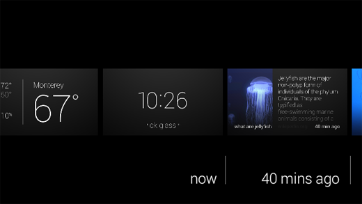
Several minutes later, a friendly woman came over with a Android tablet to welcome the individuals in the queue to the "Seattle Through Glass" event, and gave a quick demonstration of the gestures. The tablet, which was paired to the glasses, displayed a mirrored version of the Glass interface-- everything she saw, we were able to see as well.
At first, she pulled up sports scores for the Mariners baseball game using the voice interface and showed simple features such as the Timeline. Near the end of the demo, in what seemed to be a shock her audience, the spoke a command-- "Ok Glass, Take a Picture." Immediately, the photo popped up on her Glass display, and in turn was mirrored onto the tablet for us to see. Several individuals were taken aback, surprised by the lack of time to get ready for the photo.
We were then ushered over to a dark corner of the room, and were all provided with white pairs of Google Glass for ourselves to try. After putting the glasses on and adjusting them slightly, I tapped the touch-sensitive panel on the right side of my head and a floating ghost of a display appeared in the corner of my vision.
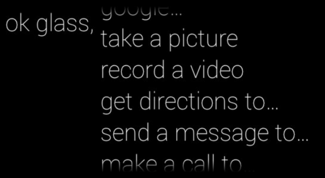

At first, I was slightly confused-- in all my past experiences, I've never had to think about how to focus on something. After I looked up and to the right, however, the display became clear and in focus.
"1:21 PM"
"ok glass"
After the device was woken up with a tap, there were only two pieces of information displayed-- the first being the current time. Just below the thin, white timestamp was simply the words "ok glass" in quotation marks.
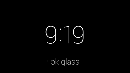
"Ok, Glass," I said.
When you pick up a Pebble smart watch, it immediately has a sense of purpose. Similarly, a Nest has a place and function on your wall-- you know what to do with it. Though modern smart devices have capabilities beyond their traditional counterparts, they always have a sense of purpose-- even it that is to simply display the time.
But with Google Glass, I paused. I didn't know what to do. On my face sat a $1,500 set of computerized glasses-- connected to the internet and one of the largest knowledge engines in the world, none the less, and I couldn't summon up a simple query. I had been overcome with a feeling of blankness-- there wasn't an obvious use for Google Glass, in my mind.
I quickly swiped down on the frame, a "back" gesture that powered the display off again.
Once again, I said, "Ok Glass." But this time, I managed to eek out a simple--if forced--question: "Google, what is the height of the Space Needle?"
The device, with its relatively mechanical voice, returned the answer-- 605 feet.
At that point, Glass felt familiar: the voice was the same used in Google Now, as well as Google's other voice-enabled products. The concept of speaking to your glasses was still alien to me, yet the familiarity of Google Glass's response made it seem like another extension of myself in the same way as my phone always had been.
I tried another query-- "Ok Glass, Google, how far is it from Seattle to San Diego?"
This time, instead of the "Knowledge Graph" card displayed in response to my last query, the glasses popped up with a Google Maps card-- showing walking directions from Seattle to San Diego. While it answered my question (it takes some 412 hours across 1,200 miles, in case you're wondering), the exact response wasn't quite what I was looking for.
I tried taking several photos and sharing them on Google+--a process that was relatively streamlined given the lack of a traditional interface--as well as swiping through past "Cards" that previous demo-ers had summoned in the hours before I arrived. The timeline was filled with several different queries and apps, one of which was CNN. Curious, I tapped on the frame as a news story about Malaysia Air Flight 370 was on screen, and the still photo was brought into motion.
This, admittedly, was one of the demonstrations that awestruck me the most. I felt like some sort of cyborg, able to watch breaking news stories on a virtual screen floating in front of my face. The sound was muddied, and though audible, not high quality. While it was passable in the exhibition room, even with the various conversations going on around me, I am not convinced it would have been loud enough to hear over the noise at a bus or train station.
Having played with the CNN story enough, I once again rattled my brain to think of features to try. Eventually, I settled on simply looking up a historical event. I was brought to a minimalistic list of web search results, though I didn't anticipate I would be able to do much with them.
To my surprise, tapping on a result brought up the mobile Wikipedia page in a full web browser. Sliding my fingers around on the frame manipulated the page. Zooming and panning around was relatively natural feeling, though I could not figure out how to click on links.
With the basics of Glass under my belt, I proceeded to the opposite side of the room-- a slightly brighter, more lively corner decorated with guitars and stereo sets. Along with the acoustic equipment was another table-- this time, with several sets of black Google Glass.
A similar routine to that at the first demonstration area ensued, though with one difference-- the Google staff member pulled out a set of odd looking headphones from out of sight, and plugged them into the micro-USB port on the glasses.
With this newest pair of Google Glass once again on my face, I woke it up and asked it to play "Imagine Dragons." Hooked up to Google Play Music All Access, I was able to command the device to play any song I could imagine-- all with my voice.
There are several inherent flaws with listening to music on Glass, however. First, because there is no 3.5mm headphone jack, there is an unfortunate lack of quality headphones. I own a pair of Klipsch x10 earbuds-- certainly not a set of custom in ear monitors that cost half a grand--but leaps and bounds better than the headphones that are included with your phone or iPod.
The earbuds I was given at the event were specifically designed for use with Glass. Not only because of the micro-USB connector, but the length of one earbud was shorter than the other. This was necessary because the distance from the micro-USB port to your right ear is only several inches, whereas the cable leading to your left ear is significantly longer. Normal headphone cords would simply dangle around your right ear.
Like Apple's EarPods, they had a funny shape designed to project sound into your ear. Also like Apple's headphones, to my dismay, the sound quality was relatively mediocre. It was a step up from the bone conduction speaker that's embedded into the glasses frames, but it's not an impressive feat admittedly.
If you listen to major artists, whether it be Imagine Dragons, Kanye West, or Lady Gaga, you'd have no issues with Google Glass. However, some obscure artists would sometimes fail to be recognized by the voice recognition. For example, it took four or five tries for my Glass to recognize "listen to Sir Sly." Instead of playing the desired artist, Glass would misunderstand me and often attempt to look up an artist named "Siri fly."
As I stood there attempting to enunciate the word "sir" to the best of my ability, it was clear that the technology was fair from ready. It's awkward enough to dictate your music choices out loud, but it's even worse if you have to do it repeatedly. Given the number of odd looks I received from those at the event, imagine the reaction of the people around you if you were riding a bus or train.
Eventually, my frustration overcame my initial awe, and I moved to the final corner of the room.
When I walked in I had noticed this particular setup, though without a clue what it was for. There were several boxes, varying in size, with signs on them in some foreign language-- some artistic exhibit, I imagined. But as I made my trek through the swarms of Google employees swiping their temples on their own set of Google Glass, I realized what the subject of the next demonstration was.
The final booth had the most colorful Google Glass frames of all: a bright, traffic cone-orange. Perhaps it was indicative of the exciting demonstration that was to follow.
With the glasses on, the Google employee instructed me to utter a single voice command:
"Ok Glass, translate this."
Instantly, an app launched on the screen with a viewfinder similar to that of a camera. Essentially, it appeared like Glass provided a picture-in-picture experience. I walked over to an inconspicuous, white board.
"il futuro è qui," read the sign.
In an instant, where the Italian once was, Glass replaced it with the words, "The future is here." No kidding.
The concept of in-place translation is not new. In fact, it's existed for several years on other platforms, such as the Word Lens app on iPhone. The impressive part of the demo wasn't the fact that the translation could be done in place, but rather the fact that the it was the glasses I was wearing doing the translation, and it was projecting the text onto a prism that seemingly hovered in front of me.
I wandered around the demonstration area and looked at each sign, thinking about how useful the technology would have been on my recent trip to Thailand.
After several more minutes, I made my way over to the back of the room where three inconspicuous looking wooden columns had been labeled "Photo Booth." Alongside the columns was another set of tables with two racks of Google Glass: one with lenses, one without, and in four color choices.
After posing for the camera, the friendly Google employee manning the booth printed the photo out and handed it to me.
Having visited all three of the themed demo stations, I collected my belongings, received a poster, and headed back into the Seattle cold. Without Google Glass, I felt oddly primal holding only my cell phone-- having just witnessed one of the more impressive technological demonstrations of the last few years, a handheld device no longer felt adequate. I wanted more than just the ability to retrieve information-- I wanted to summon it.
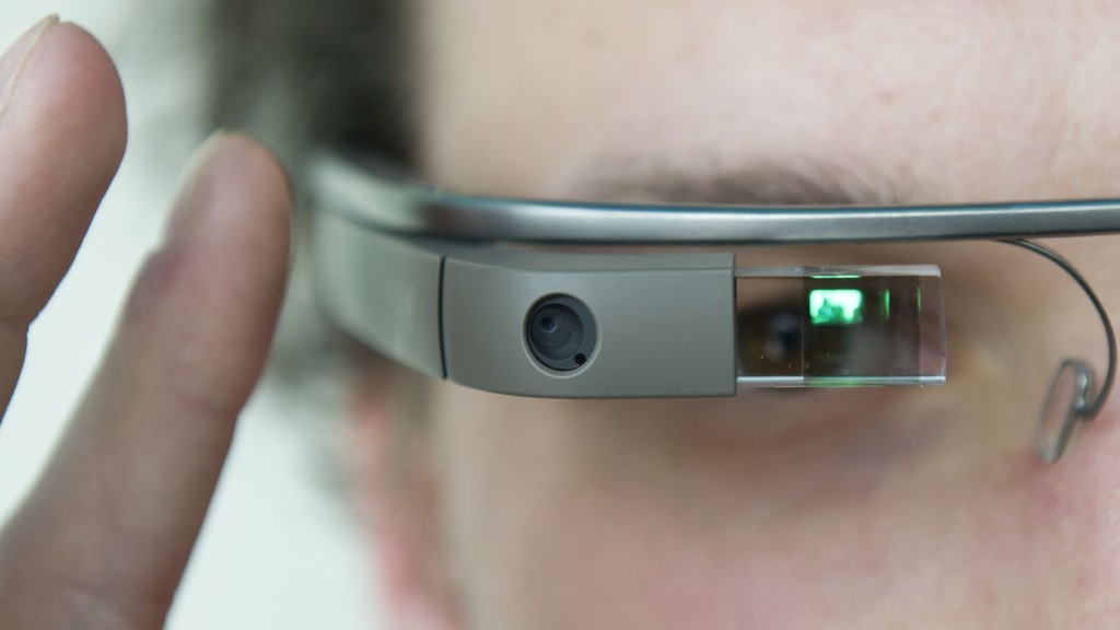
Glass is an impressive device, though it would be wrong to call it a product. The hardware has the polish-- it's sturdy and lighter than I anticipated-- though it lacks in sex appeal. Glass, to be blunt, looks like a device that belongs in a science fiction movie, not something you'd expect someone to be walking around with in downtown Seattle.
The voice interface is your primary method of input, yet it lacks the accuracy of your fingers. You may find yourself repeating commands often, and if you don't know the pronunciation of a restaurant or venue, you're out of luck entirely. And even if the voice commands do work correctly, you'll likely look around and catch a brief glimpse of the cold glare from strangers sitting next to you. Voice commands may be ideal when you need a hands-free way to convert cups to fluid ounces in your kitchen, but not to check the latest sports scores while you're riding the bus home.
Google has a winner on their hands-- maybe not in its current form, but Glass represents a category of devices that will flood the market in the next several years. As a society, we're always looking for an easier and more intuitive way to consume information, and wearable electronics let us do just that in an inconspicuous manner.
When Glass is launched to the public later this year, we can only hope the current $1500 asking price is lowered dramatically. Especially with the high mental barrier of entry and the "nerd" stereotype emanated by Glass, Google needs to hit a price point of $200 or less to reach beyond their core audience of technophiles.
Even if Glass is only adopted by enthusiasts, this is not necessarily a bad omen, nor does it spell the end of the product. Rather, it should be taken as a sign that Glass is still not quite ready for the general public-- either stylistically or economically.
Google isn't primarily in the hardware business and its livlihood doesn't depend on Glass. They have the freedom and resources to turn the glasses, or wearable electronics in general, into a mainstream product. After all, imagine what sort of data they could glean from the public if every man, woman, and child in the world had an additional few sensors on their body.
I, for one, look forward to a future in which every device I own is networked-- the Internet of Things pushed to the extreme, and Google's "Seattle Through Glass" event only made me even more excited.
Shortly after the sync applications were leaked early, Microsoft officially unveiled their latest wearable product-- the Microsoft Band. The Band is not a smartwatch, but rather a fitness centered wearable device with several smartwatch-like features. The device's claim to fame comes from its unique blend of 10 sensors that constantly input data and send it up to Microsoft's new Health platform.
I own and previously have used several wearable devices, including an early Timex Internet Messenger watch1, Cookoo, and Pebble. All of these devices had one thing in common-- they were first and foremost a watch. However, they were all augmented with some form of notification technology, whether it be a primitive pager-esque text notification system, or a full on interactive device as the Pebble is.
Wearable devices fascinate me because they show our ability to shrink mountains of technology into smaller and smaller packages. For a while, mobile phones got smaller and thinner, yet more powerful, every year. But we've recently seen a trend of bigger devices. The phones still are more powerful, but it is not quite as obvious that the technology is getting smaller and more efficient.
I've been quite disappointed with the recent influx of Android Wear watches, primarily due to their battery life. Oddly, one of the pain points of my Pebble is the battery-- and this is device that gets almost a week on a single charge. I know that despite the Moto 360's captivating looks and round screen, I would not regularly wear the device because I would forget to charge it. And then there is the pain of carrying yet another charging cord during travel, though this is a non-issue with the Pebble on short-to-medium trips2.
It doesn't matter if your smart watch can find the meaning of life itself-- no wearable device is useful if it is always dead, which is why I prioritize battery life ahead of most everything else. The Band is an interesting compromise between Android Wear devices and the Pebble. It is rated for two days of battery life, which I have found to be an underestimate, so that on the days day that I forget to charge the device, I do not just have a hunk of electronics on my wrist: the Band continues to plug along happily until I can make it back to my charger.
The issue of charging is slightly complicated due to the fact that it is designed to track your health metrics 24/7. Especially since the Band is designed to track sleep, during the time during which you charge most of your devices, the Band is still working for you. I've found that when I am sitting at my desk or getting in the shower, plugging in the Band for 15-30 minutes at a time at least twice per charge cycle (i.e. every two or more days) seems to work well.
Sensors and Hardware
Since the Band is primary a fitness device, it has several fitness-focused sensors including an optical heart rate monitor and GPS. The heart rate monitor is relatively accurate, and takes measurements for a single minute once every ten minutes during daily activity. During sleep, the device tracks your heart rate for two minutes once every ten minutes, and when running, the device tracks you heart rate once a second. The Band is not quite as accurate as other chest strap monitors, but it provides a fairly convenient way for the average person to measure their heart rate over the course of the entire day.
The GPS can be enabled when you go on a run. This is probably one of the most unique features of the Band: most fitness watches with GPS built in are bulkier than your average FitBit or Jawbone device, but the Band includes this without the significant bulk seen in devices such as some of the Garmin Forerunner models. I have not tried running with GPS enabled yet thanks to the near-freezing temperatures we have seen in Seattle, but in theory this will allow for people to leave their bigger phones at home while still tracking all of the same metrics. If you're a phablet lover, the iPod may once again be useful: an iPod Nano plus a Band together would make better running companions than your massive iPhone 6 Plus or Galaxy Note 4.
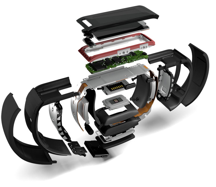
Other sensors included on the Band include an accelerometer, UV sensor, galvanic skin sensor, ambient light sensor, and microphone. The "10-sensor-package" is a great marketing pitch, but you actually won't find anything too novel in the Band other than the galvanic skin response and UV sensors as well as GPS-- the others I would expect any smart device to have.
The UV sensor is interesting, though it has little practical daily use. Unlike the heart rate monitor and accelerometer, the UV sensor has to be explicitly activated with one of the tiles on the Band. At that point, the sensor will collect some data over a couple seconds and let you know how long it would take, on average, for your skin to burn in the sun. Living in Seattle, this is practically useless at this point in the year since there is so much cloud cover and so little sunlight. It is one of those things that is cool to show off, but ideally this sensor would be used automatically and you would receive a notification or something if the sun was particularly strong one day.
The galvanic skin response sensor in theory can track things like stress levels, but I don't believe it has any particular use at the moment other than telling the band whether it is being worn or not. There are two contact points-- one under the screen, and one on the opposite side of the Band next to the heart rate sensor. Since the sensor itself is included in the hardware, I am looking forward to seeing whether Microsoft will enable any new features in the Band's software.
Many reviewers expressed concerns over the actual hardware itself and indicated they thought it was an uncomfortable device to wear. On one level, I agree-- you will probably notice you are wearing a new device at first. The Band has to be relatively tight to measure your heart rate properly (especially when you are jogging or doing physical activity where the device is moving around), and its stiffness keeps you from completely forgetting it's there. This is one area that devices like FitBit's, the Jawbone, and Nike FuelBand excel-- they are relatively discreet and light, so they're easy to forget about. The Band, however, is probably always going to pop into your mind, even after you get used to wearing it.
That isn't to say that the Band is completely uncomfortable. It's something that I notice, but also don't mind. The clasp is actually quite nice and allows for the device to be adjusted on the fly, so you can wear it more loosely during the day and tighten it up when running to ensure a better read on your heart rate. With my winter jacket on (and the Band underneath), it's hard to tell that the device is there because it feels similar to the way the sleeve fits around my arm. Certainly, I would suggest to try it on at a Microsoft Store to get a feel for it. The device may not feel fantastic at first, but remember that you will at least get used to the feeling.
The Band comes in three sizes-- small, medium, and large. I am a skinny 20-year-old male and opted for the small. The device fits tightly around my wrist at the smallest setting on the small Band, and with the largest opening it will slide relatively freely around my wrist. There seems to be a slight overlap on the sizes, so the largest setting for the small band is larger than the smallest setting for the medium. Again, this is something you will need to try for yourself at a Microsoft Store.
Fortunately, as mentioned earlier, the clasp is quite nice-- there are two buttons on opposing sides of the clasp that expand and retract pins on the inside of the band, which allows you to simply press and move the clasp to open and close it. There is a satisfying click when the clasp is secured, and it feels relatively solid. I wouldn't pull extremely hard on the two ends of the band to try and separate them, but it will definitely hold up to daily use and exercise. I actually tend to like this style better than a traditional watch strap-- the Pebble will come undone sometimes and the rubber "tail" will come out of the piece that is supposed to hold the loose end of the strap. This is never an issue with a clasp like that on the Band because there really is no additional "tail" section.
A lot of the photos you see of the Band show people wearing it on the inside of your wrist. While the Band does work both ways, you will likely do the same and have the Band on the inside. The issue is, if the band is on the outside of your write like most watches, you will never be able to look at the screen straight on-- it will always be at an angle. However, if you have the screen on the inside of your wrist, you can naturally bend your elbow in a way that makes your arm perfectly perpendicular to your body, and consequently have the Band's screen pointed directly at you.
Microsoft Band's Software
The Band is not a powerful device. It contains quite a few sensors, but only two 100 mAh batteries and runs on a low powered Cortex M4 MCU processor. It shows in the software in some areas-- scrolling, in particular. Rather than provide a buttery smooth interface like a smartphone, Microsoft has made the smart tradeoff of using a lower powered processor to provide longer battery life at the expense of software performance.
But, it doesn't really matter.
The software for the Band is actually quite good. Microsoft's "tile" aesthetic works very well with the band form factor, and though the horizontal scrolling on the home screen is somewhat tedious, it is passable. Honestly, I only scroll through the menu once per day, and that is to invoke the sleep application.
The Band is slightly more utilitarian than other devices, such as the Apple Watch-- there's no fluid zooming animations or other embellishments, but the Microsoft "tile" style both looks good and functions well.
The minimalistic interface is composed of text and rectangles. In fact, you will really only see the colors black, white, and the accent color you've chosen for your wallpaper. Only the Starbucks app uses anything other than these three colors as far as I've seen. Though I appreciate Starbucks's desire to keep their branding, the green icon looks quite out of place in the row of monochrome, minimalistic glyphs.
The first tile-- called the "Me" tile--takes up the entire screen initially. It contains the time, and another metric of your desire-- current date, steps, calories burned, distance, or heart rate. The secondary metric can be changed with the action button. Tapping on the "Me" tile brings up a horizontally scrolling list of the aforementioned metrics-- nothing too exciting.
The other tiles on the main menu represent different hubs for notifications, as well as apps. The message, email, calendar, and notification center tiles simply collect their respective notifications. The notifications are displayed in a horizontally scrolling list of items, and messages that are too big for the line or two of vertical space available will scroll vertically as well. The vertical scrolling is not ideal-- the screen is too small to really make scrolling up and down worthwhile-- but it does function as you'd expect. I do prefer the Pebble's screen for longer notifications, as well as the physical button controls that are used for scrolling on that device.
With an iOS device, incoming notifications trigger a subtle vibration in the Band with the option to dismiss the notification on the phone. This is actually a big plus for the Band. Unlike other fitness devices, you can at a glance see who is texting, calling, or emailing you. By including notifications, Microsoft has made a bridge between a serious fitness device and a smartwatch-- one that many everyday people will want to take advantage of.
These "smartwatch" features go even further if you have a Windows Phone-- you have access to Cortana through the built in microphone, and you can speak to her to set reminders, ask questions, or perform other tasks like play music.
Daily activity, including walking, is tracked fairly accurately. The measurements between my phone's internal accelerometer (with Apple Health) and the Band's statistics are close enough.
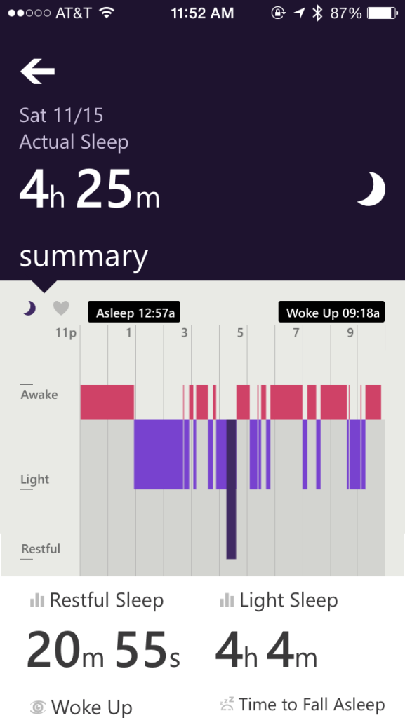
Sleep is also fairly easy to track-- you simply have to navigate to the sleep tile and hit the action button to let the Band know you are in bed. The actual, calculated time slept will actually be different than the time you press the action button to indicate you are going to sleep, which is nice. Obviously, you will never fall asleep instantly, so you do not have to worry about tossing and turning messing up your actual sleep statistic. The Band will still let you know how inadequately you are sleeping, even if you are "in bed" for 12 hours.
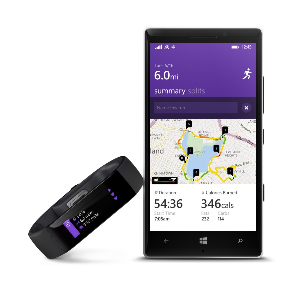
The workout and run tiles are essential to the Band's functionality, but at the same time, are incredibly simple. After tapping on either of the tiles, you can hit the action button on the device to start and stop the activity. Before starting your run, you can also swipe over and turn GPS functionality on, though this will dramatically decrease the battery life.
There are a couple of other cool features fitness wise, including guided workouts. This allows you to download a workout from someone-- Gold's Gym, for example-- and have it uploaded onto your Band, which measures your movements and determines how well you are performing, along with counting your reps and heart rate. Once again, this is a feature I have not tried out yet and likely will not use extensively3, but more information on guided workouts can be found elsewhere on the web.
Sync Software
The Band connects with Microsoft's new Health platform, which is available on Windows Phone, iOS, and Android4. Additionally, there are sync apps for Mac and Windows, so I suppose you could regularly use the Band without a smartphone if you really wanted to, though you would miss out on a lot of cool features.
The mobile phone apps all look the same and have the same style. They seem to be relatively consistent, which is actually quite impressive for a cross platform effort.
However, on iOS, I had some pretty significant trouble actually pairing the device initially. After turning the Band on and pairing it with my phone, I received a "Network Error" indicating that I had no internet connection-- completely untrue. Hitting retry simply brought up the same dialog box, and switching between WiFi and LTE did nothing. I was stuck, and there was no way to restart the "Getting Started" wizard since my Band simply said "Almost There" and did not respond to any interaction.
After something like 30 minutes of fiddling around with the retry button, closing the app, and rebooting, I forgot the Band from my phone's Bluetooth settings. This time, I didn't even get as far as I previous attempt-- the Band didn't show up in my Bluetooth settings at all, with no way to pair with the device. Furthermore, at some point, devices named "Accessory" kept appearing on screen, making an endless list of "Nearby Devices"-- all titled "Accessory".
Eventually, after a trip (back) to the Microsoft Store to fiddle with the device in front of the employee, I managed to re-pair the Band and set it up successfully. The initial setup experience is crucial for any device, and the friction required to get this Band setup was immense. I do not know what caused the long chain of events I experienced, but the fact that there seems to be no documented hard reset key combination is a little frightening. If a user, for some reason, cannot access the factory reset menu inside of the Band's software, how can you re-pair the device?5
After sleeping with the Band and waking up in the morning, I left my phone in my bedroom as I worked elsewhere. A few hours later, I had trouble syncing with the app, and it appeared the only way to re-sync was to do a complete factory reset of the Band and un-register the device from the app. Starting from the beginning worked fine, though it was a massive pain, and I lost about 400 steps worth of data in the morning from shuffling around the apartment.
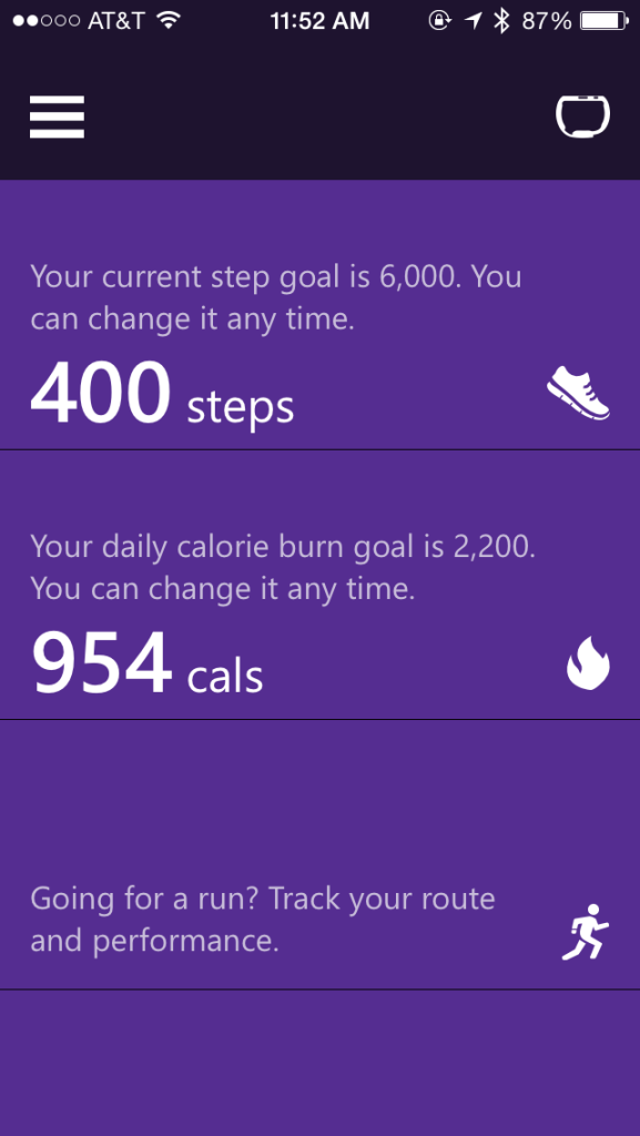
Once setup is complete, the actual Band smartphone software is alright functionality-wise. There's a list of tiles like what you'd see on the Windows Phone start screen that contain information on your current steps, calories burned, runs, exercises, and sleep. It's a relatively effective dashboard that lets you know how you're doing today, without being overwhelming. Of course, all of this data is synced over Bluetooth periodically, so it may lag behind by a couple hours to an entire half-day. That's fine, because you can simply trigger a manual sync if you're desperate to see the latest information on your phone. This info is also available at a glance on your Band at a lesser detail level, so there's no real need to look at the dashboard itself if you're just checking out how you're doing on steps for today.
Delving into more complex charts in the apps is quite easy. For example, your daily walking activity is broken down by day and charted by the hour, and allows for displaying either the number of steps you took over each hour of the day, or a graph of your heart rate. Previous days are easily accessible by scrolling down below the "today" graph, and weekly summaries are available by swiping to the side.
Sleep charts are also quite simple, and look similar to what you might see on a sleep tracker application for your phone. Of course, this is because the Band is tracking the same sort of metrics the phone apps do, just with higher accuracy (the accelerometer is directly attached to you) and with a heart rate. If anything, the Band seemed to be overly sensitive and indicate I woke up more than I did-- maybe I'm just a restless sleeper.
I personally have used a sleep tracking application for quite a while on my iPhone, though more recently for the "silent" (i.e. vibrating, rather than a blaring sound) alarm than the actual sleep tracking. While I periodically look at the chart to say, "huh, I slept XX hours last night", there's not much you can do with the data. Sure, you can see when you didn't sleep well or how often you woke up, but is this information truly useful? Not really.
Regardless, it is still quite cool to see metrics such as your heart rate tied to your sleep. I currently have a cold, so my trip to the bathroom to clear my nose at 6 AM is quite obvious on the heart rate graph as well as the motion graph. Again, I already knew that I was having a bad night's sleep, but I suppose the fact that I only slept for around 4 hours is interesting if true6.
Personalization
The Band is relatively customizable, though not to the same extent as other smartwatches. Though you can't have custom watch faces like the Pebble or Android Wear, the Band provides quite a few different colors and backgrounds. There's no free-form color picker, however, so if you dislike all of the provided colors, you're out of luck.
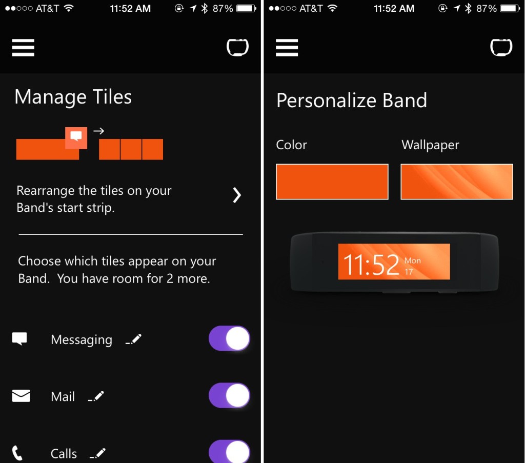
The tiles can be rearranged, added, and removed at will, though saving any customization options results in a somewhat lengthy "sync" process. I would expect a simple color change or tile rearrangement to occur in milliseconds, but sadly this is not the case. However, you will likely perform this process five or six times when you initially receive the Band and never have to do it again, so it's only a minor annoyance.
PC/Mac Software
Conveniently, there is Mac and PC software available to sync your Band. It is completely unnecessary if you have a smartphone, but supposedly it is faster than syncing with the phone. Of course, this is only true if you forget about pulling your USB cord out and attaching it to your device. Honestly, I don't see using the desktop software much. I really only booted it up to try and finish setup when the Band was initially borked.
The software itself is relatively basic, but it is just functional enough to sync your data. It, like the smartphone software, is linked to your Microsoft account so all of your data will be stored in the same place. In the event you sync using your computer, you should still be able to see the same information on your phone.
Conclusions
Microsoft is really on the right track with the Band. Not only does the device have an extremely good feature set, but the software and hardware all actually work well. There are a couple things that I think Microsoft really missed out on:
- The Band is not waterproof. Considering a big part of the Band is the guided workouts, which detect how you are performing, it would have been fantastic to have the Band coach you through your swimming strokes.
- They didn't actually make enough hardware.
The waterproof issue is more of a minor point. It's a feature that would have been cool to have, but the level of water resistance the Band currently meets means that you won't be in danger of ruining your Band if you get caught in the rain on the way home. Maybe for version 2.
However, the Band has been almost impossible to find in stores-- you're pretty much required to backorder the device and hope it shows up in a couple weeks in Washington, though the store associate seemed to suggest some store in Texas had a ton of them that weren't selling and needed to be redistributed. Microsoft actually has demand for the device, and despite it being a showcase for their Health platform and sensor technology, they should have been able to meet (or scale up to meet) the demand-- especially since it's the holidays and a lot of people will be looking for gifts.
Over the next year or so, I am interested to see where Microsoft takes their Health platform. They seem to have ambitious goals, but right now it's unclear when or if they'll meet them. They have to sell hardware that interfaces with Health first, and so far they are off to a decent (if slow) start.
- This was an early form of a smartwatch that essentially was a pager and digital watch in one device. My parents would use it to let me know when it was time to come in from playing, way back when. ↩
- Weekend trips to visit my grandparents often last no more than four days, which is easily doable on the Pebble's battery life. Journeys to places much farther away (i.e. internationally) normally last one to two weeks, so the Pebble is normally just left behind since there is no cell service anyways (as a result, there are also no notifications to see on the watch). ↩
- My exercise generally consists of running, but not other "exercises" like the kind you'd find from the guided workouts feature. Though, there are some cardio/running guided workouts for the Band which I may try at some point. ↩
- Bluetooth 4.0 is required as the Band uses Bluetooth LE, so check your Android phone before purchasing a Band. The iPhone 4S and newer has Bluetooth 4.0 built in, as do Windows Phone 8.1 devices. ↩
- To be fair, setup was painless for another family member's Band. It was likely circumstance or something I did that started the endless "Network Error" messages. ↩
- Did I actually get up 12 times and only sleep for about 4 hours? I don't know, but it sure felt like it. I'm inclined to call it accurate. ↩